Designers pondering the “next big thing in marketing” should consider the importance of point of view and its role in determining “the new.”
The magazines I’ve always found most interesting are the ones with a clearly articulated perspective. These are the publications that jump out from the relative beigeness of the newsstand to declare an intention—an attitude.
A clearly defined point of view is critical to building a strong brand. Most of the time, we think about this in editorial—or strategic—terms. But design is an important part of the point of view conversation. In many ways, it’s what most clearly articulates a brand’s perspective. By looking closely at design, we can chart how perspectives change over time, and how new and energetic points of view emerge.
With this in mind, I dug up some magazines that, in their own time, were known for game-changing art direction and represented influential points of view. They are now pop cultural artefacts.
Eros
Summer 1962
Let’s begin by going back to the era of Madison Avenue advertising. Eros magazine believed expressing human sexuality was fun and healthy. Its voice comes across as more mature than what we hear today as it is a product of a time when the full effects of the youth revolution were still not fully felt. Herb Lubalin served as art director of Eros, and his designs injected a sense of subtlety and grace to the subject matter—a visual representation of the laid-back attitude the magazine took towards sexuality (despite what some critics and readers might have thought in the ’60s).

The Face
December 1985
The Face gained perspective under the eye of Neville Brody, one of the most influential designers of the 1980s. Brody injected a sense of raw creative energy to the magazine. He was influenced by the punk movement proliferating in the U.K. at the time, which he was able to clean up just enough to make palatable for a mass audience.

Interview
December 1986
Interview magazine was initially an Andy Warhol production dedicated to the “cult of celebrity.” Not only is the larger than life size of this magazine a pleasure to hold it’s also completely brand appropriate—big pictures for big personalities.

RayGun
October 1993
The look and feel of RayGun set the tone for the 1990s. The magazine trended toward highly expressive design—regardless of legibility or the normal rules of communication. Designer David Carson embraced the advent of digital design tools, which he used to manipulate fonts and layouts—he literally pushed the voice of the magazine into the margins, making RayGun a champion of emerging movements like Grunge and an antidote to placid, establishment music magazines like Rolling Stone.

Colors
March 1996 – No 14
As part of United Colors of Benetton’s marketing strategy, Colors was often controversial. With the photographer Oliviero Toscani in charge, the visuals are rich and striking, privileging shock value above all else. These images clearly gave the magazine—and also the company—a clear voice, speaking out for multiculturalism and against the status quo.

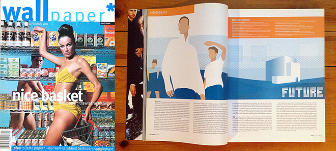
Wallpaper
March 2000
Wallpaper is the creation of the designer and editor Tyler Brûlé, who later went on to found Monocle and the creative agency Winkreative. Wallpaper’s clean lines are a throwback to mid-century modernism, albeit a softer, more feminized version. The look and feel of the magazine is all about cleanliness, advocating the refinement and simplicity of modern life. It’s an aesthetic we’re still very much surrounded by today.

What are today’s characteristic points of view? Tomorrow’s? And how are they reflected through design? Common wisdom says digital publishing, content sharing, cross-linking, remixing and reassembling are proliferating more of them than ever. Surely that’s a good thing.