Proximity
Industry
Health and Wellness
Our work
Brand strategy and positioning
Naming
Identity design
Launch strategy
Organizational collateral and templates
Website design
Copywriting
Web development
Documentary filmmaking
Publication design
Office interior branding
A new name and brand to redefine a healthcare foundation
The mandate of a 25-year-old foundation was transformed to meet the unprecedented challenges facing Ontario’s public healthcare system. The proposed mandate would address the importance of leadership for Ontario’s hospitals. A new brand and positioning was required.
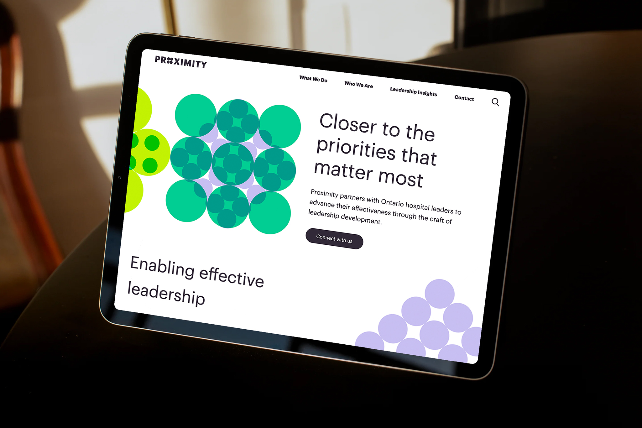
The Foundation leadership team turned to Pilot to lead a rebranding process that included the design and development of a new name, visual identity, brand story, and online presence that was consistent with its new mandate.

Insights and Understanding
Our approach to brand strategy and design is rooted in a deep understanding of human behaviour, and the motivations of those interacting with the brand. Our approach relies heavily on qualitative research and intense listening – achieved through one-on-one stakeholder interviews conducted in pursuit of real insights and underlying truths.
Pilot spent considerable time with the management team of the Foundation and engaged in more than 30 one-on-one interviews with hospital CEOs and board members, OHA leadership and board members, as well as sector experts and thought leaders.
Through this process, we came to a deep understanding of the organization’s purpose. Their superpower lies in their sector “proximity.” Only those close to the issues – those with intimate knowledge – can deliver deep insights and strategic understanding that will lead to effectiveness in their mandate. Meaningful progress requires a close ally and sector insider. ‘Proximity’ became the core of the new brand and its new name.
Doing the Right Thing
When we initially presented “Proximity” as the new name for the organization, senior leadership expressed concerns. They weren’t convinced. We, however, felt that we were on the right track.
We took the step to explore the name through an internal creative exercise to see if we could represent the brand in modern and expressive ways. Happy with where we landed, we went back to the client to show the name in action that brought the brand to life. In that very meeting, the organization’s leadership embraced the direction, and the new name was ultimately approved by the board and adopted.
“Through an iterative process that extended beyond the contractual agreement, Pilot’s tenacity and dedication carried throughout.”
– Annie Tobias, CEO, Proximity Institute
The Branding Challenge
Developing a new brand can challenge clients in ways they hadn’t anticipated. Brand transformation is not something organizational leaders engage in very often. This is why a transparent and iterative working process is essential. We ensure every stakeholder is an active and valued participant in the process.
Not only does this transparent and inclusive approach to brand building lead to good decision-making, it also equips the client to effectively work with their new brand long after we are gone.
Proximity Visual Identity System
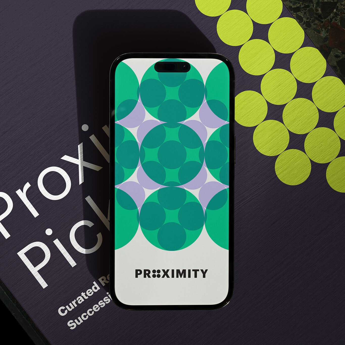
Our visual inspiration for the brand came from Gestalt psychology and its five principles. Gestalt principles describe a variety of ways humans group diverse stimuli in order to make sense of it. Without using patterns to order what we are seeing, our brains would be completely overwhelmed. These principles are: proximity, similarity, continuity, connectedness, and closure. Gestalt psychologists use simple and elegant dot diagrams to represent what is actually going on in the brain when we organize the information we are consuming.
For our creative team, this was an inspiring and original way to represent Proximity’s role within healthcare. As an organization they seek out, compile and analyze diverse and wide ranging information from stakeholders and through research, organizing and analyzing it for insight and clarity. In essence, making sense of it. Working with these inspiring Gestalt diagrams, we were able to construct an elegant and effective brand identity system – one that fully supported the organization’s value, brand position and narrative.


With this system in place, we developed all of the organization’s brand tools, including stationary, presentation decks, and conference materials. We developed their new website and consulted on the design of their office interiors. We produced two documentary-style films, as well as designed a first-time, large format research publication that was distributed to every hospital CEO in the province.


The Results
After the launch of the brand, Proximity reached into the market to test for brand awareness and understanding of their new mandate. Seventy-four percent of hospital leaders were aware of Proximity – a very high number considering the short time the new brand had been in place. Even more rewarding, when asked what words respondents associated with Proximity, the most common were “leadership” and “development.” In a few short months the new organization not only had name recall, but clarity on their purpose and core mandate.
“Grounded in a culture of transparency, integrity, and collaboration, Pilot quickly became a trusted ally – building our understanding and enabling positive pivots to better align with our objectives. Simply put, we could not have asked for a better partner to complete our branding endeavour with.”
– Annie Tobias, Proximity Institute
