A mom and pop fitness empire needed the tools to expand. Fit Feels Good offers numerous programs, all under different banners and identities. Their language was catchy, but there was too much of it. Programs often had multiple names. There was a lack of clarity across the washboard abs. Our job was to tone up their branding and messaging, and create a kick-ass brand that a small organization would be able to run with, despite limited design resources.
Unbrand it
Our Story Design solution centered on unbranding the Fit Feels Good brand. Instead of a highly prescriptive and starchy system, the Fit Feels Good’s branding would reflect their flexibility and openness as an organization. They offer fitness for the rest of us – a feel good, do it when you can brand – health and wellness that works because of its anti-type A attitude. Their new brand would tap into and amplify their established original voice.
Getting to the core of the issue
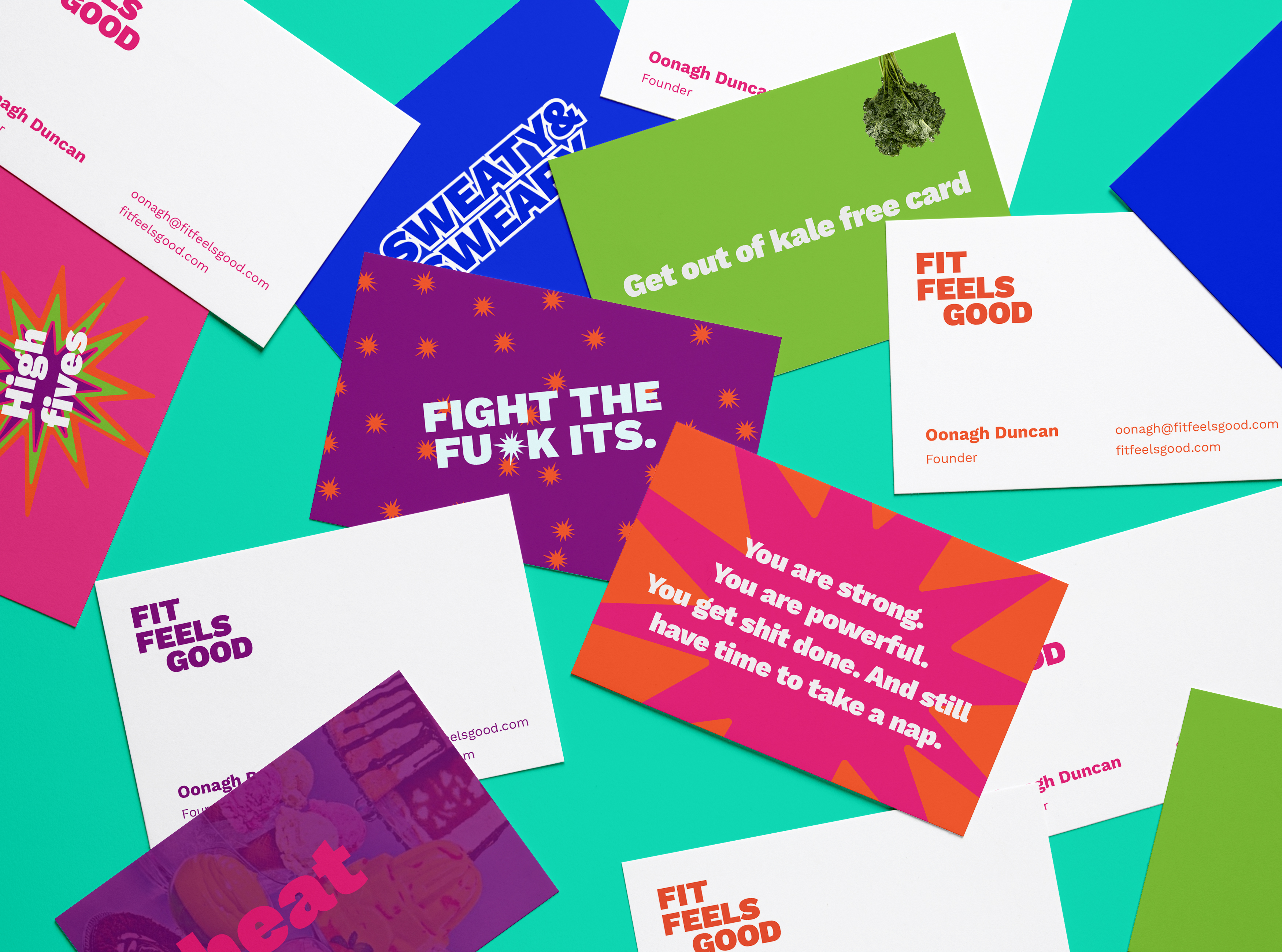
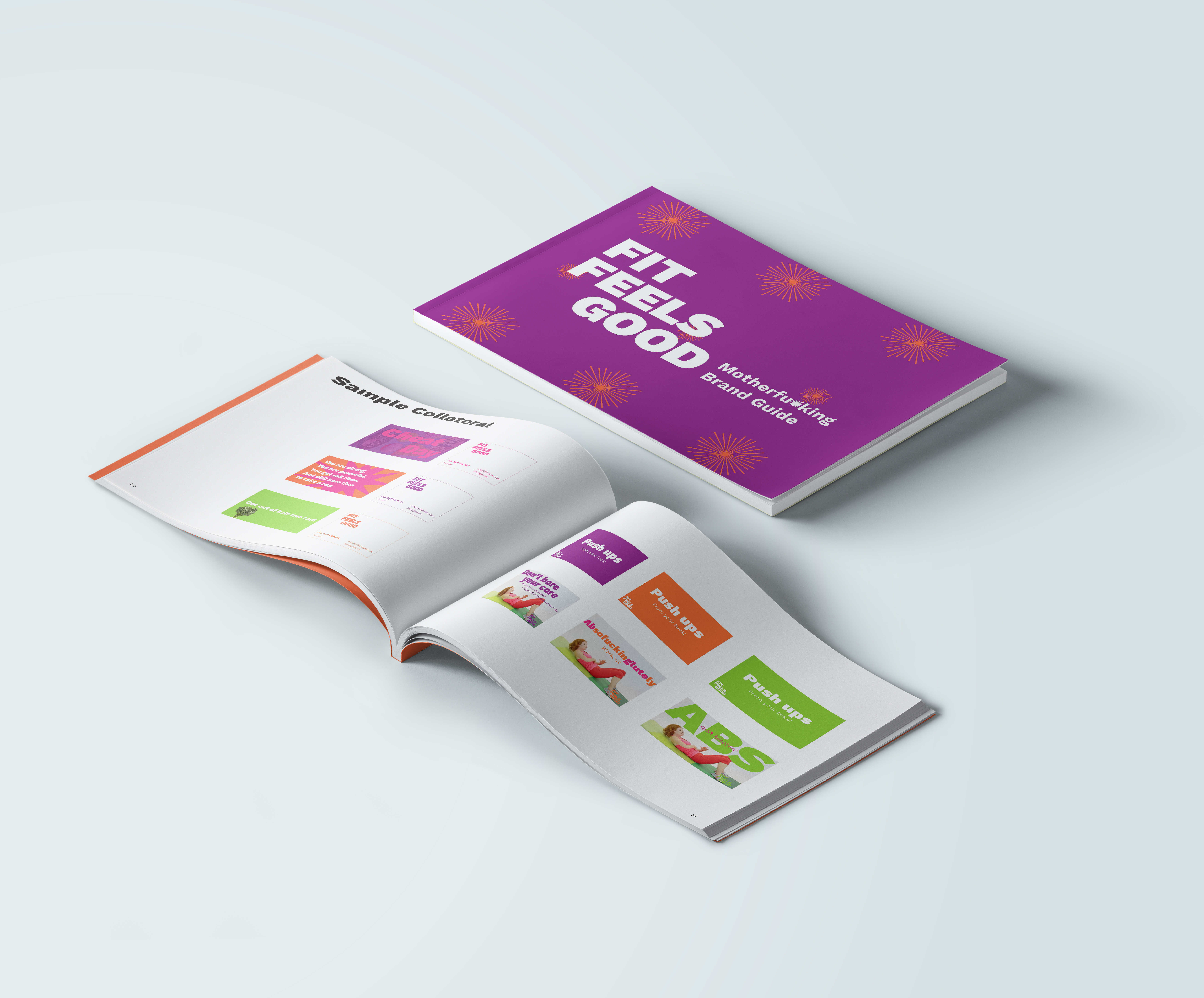
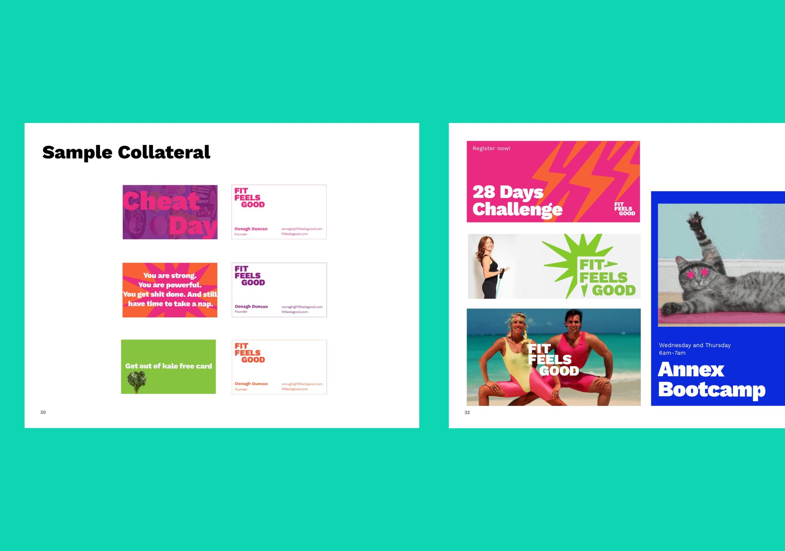
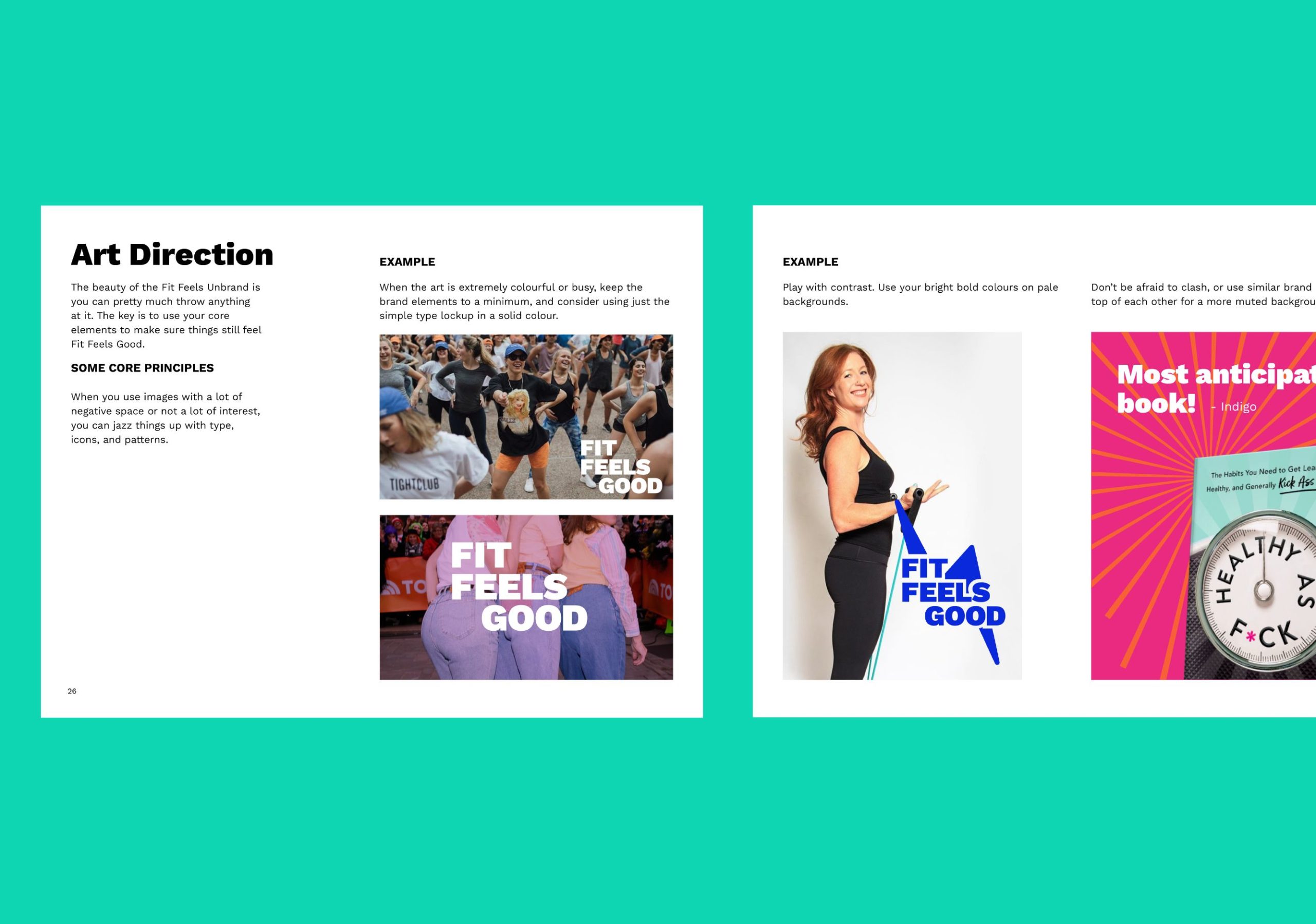
We focused on the idea of a strong core. If the core elements were strong, the rest of the elements could be experimental and fun and different. We gave Fit Feels Good strong type, bold colours, and a very simple hierarchy and icon system, so that they could go to town with their leg warmer aesthetic.

We gave them a collage makers toolkit that even non-designers could use, with the result always being accessible and playful.
Our Work
- Brand positioning
- Identity design
