Toronto Public Library
Industry
Nonprofit, Public Sector
Our work
Research
Brand strategy, story, messaging, and positioning
Service design
Identity design
Brand guidelines
Collateral design
Applied Arts award winner: Entire Design Program
Red Dot Design award winner: Brand Design
A new children’s brand for the world’s busiest public library system
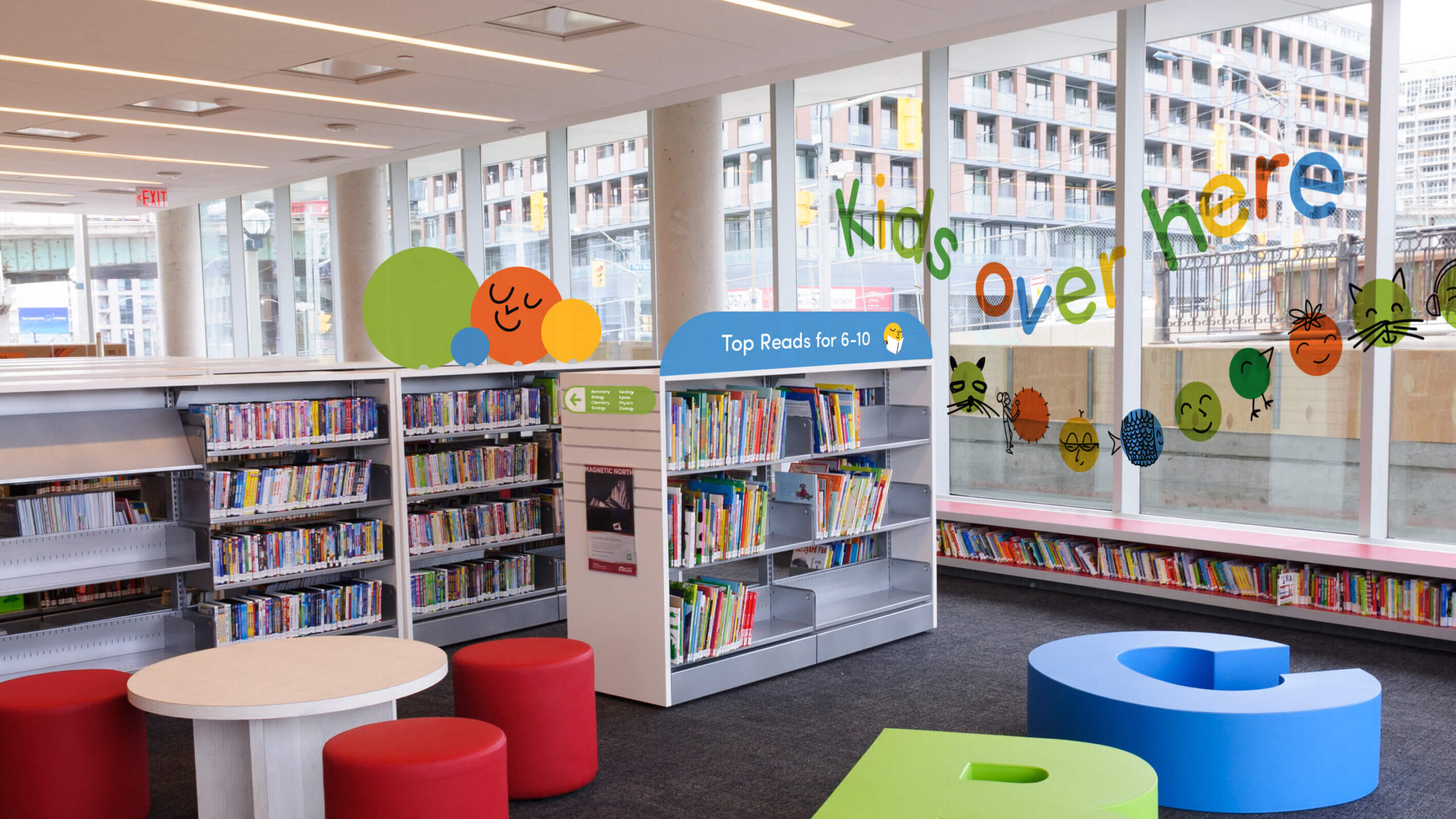
The Toronto Public Library is a big, beloved institution, and its first children’s expression needed to build a framework for spaces, print and digital. We created a bold, fun license to ‘go’ that transforms to the ever-adapting needs of our client. The expression is a visual reflection of this license to go, to explore, to be. The library is unique in that it asks nothing of kids but for them to take what they need.
From the ubiquity of online education and entertainment, to the host of other family-oriented activities that fill a city, the Toronto Public Library’s children’s department has never had stiffer competition for kids’ attention. The brand needed a modern refresh, one that took into account not just the breadth of programming offered under the children’s banner, but that could work across a diverse array of spaces, both physical and digital.

On The Books
First we had to figure out why children and caregivers were unable to see the full breadth of the library’s offerings. We started with focus groups of parents and children, taking them through libraries to find out what they liked, what they didn’t, and what kept them from using the space.
Then we took those concerns to every level of library employee, workshopping potential solutions and suggestions to improve the experience. Finally we visited branches all over the Toronto to figure out what was already working, what needed to be improved, and what was feasible across such diverse places.
Agency Space
We learned that the key to capturing a child’s attention was a feeling of agency: they needed to know the library was their place, their world to explore. The library was there to help them create their own experience — to help them find what they need, make what they want and realize their dreams. The promise: To empower kids to pursue their dreams by fostering a lifelong love of learning.
Dot Dot Dot
The core of our solution was the green GO dot. It’s a literal green light for children: an easily understood, compelling message to learn, explore and create.
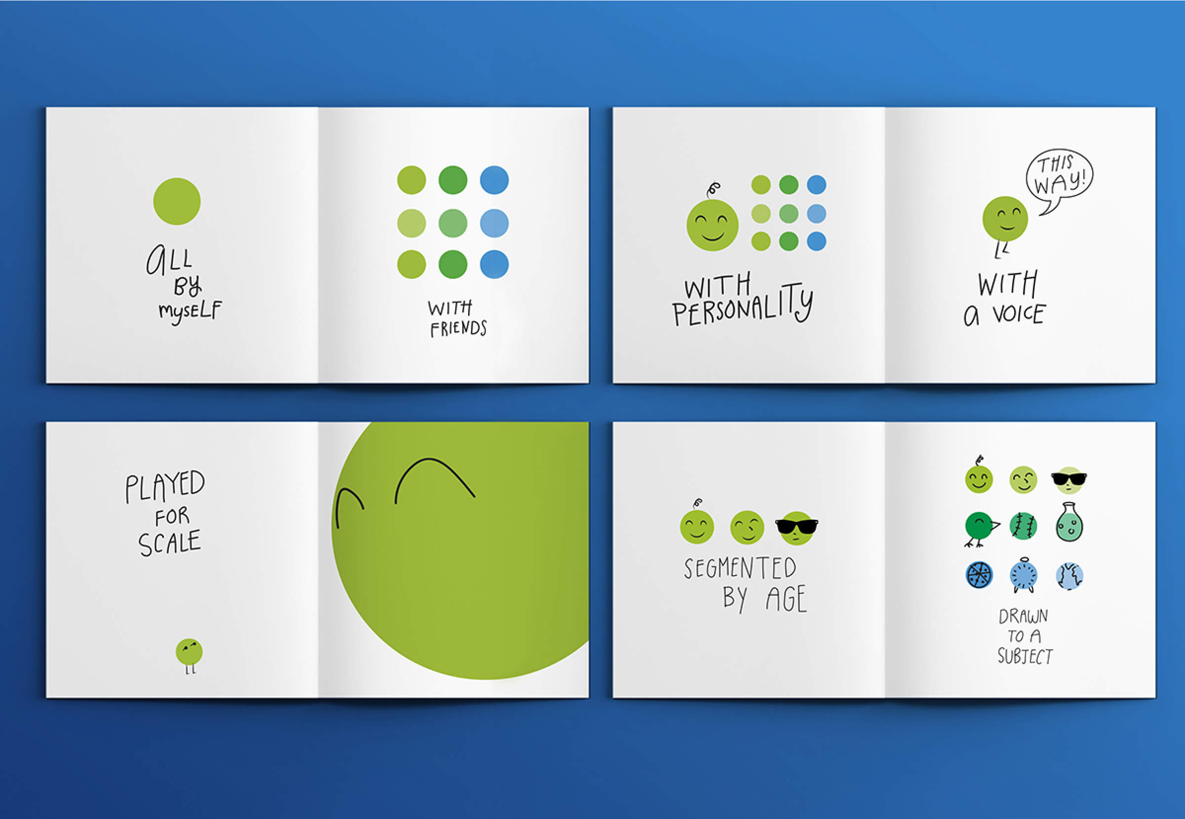
The simple application of the GO dot allowed to be adapted across the library’s varied needs, from strategy and graphic design personality to wayfinding and customer service.
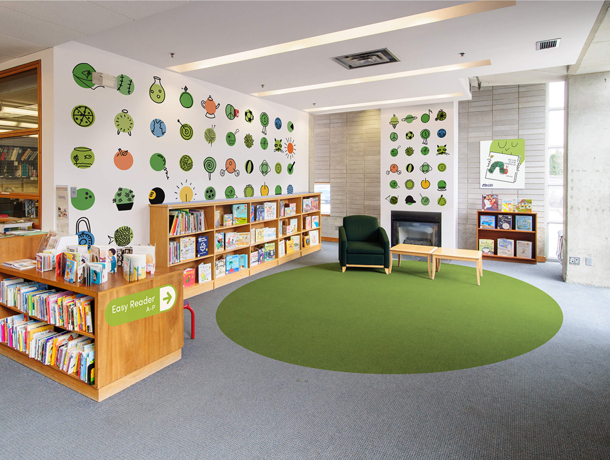
It was easily applied to every aspect of the children’s experience, across the library’s varied forms.
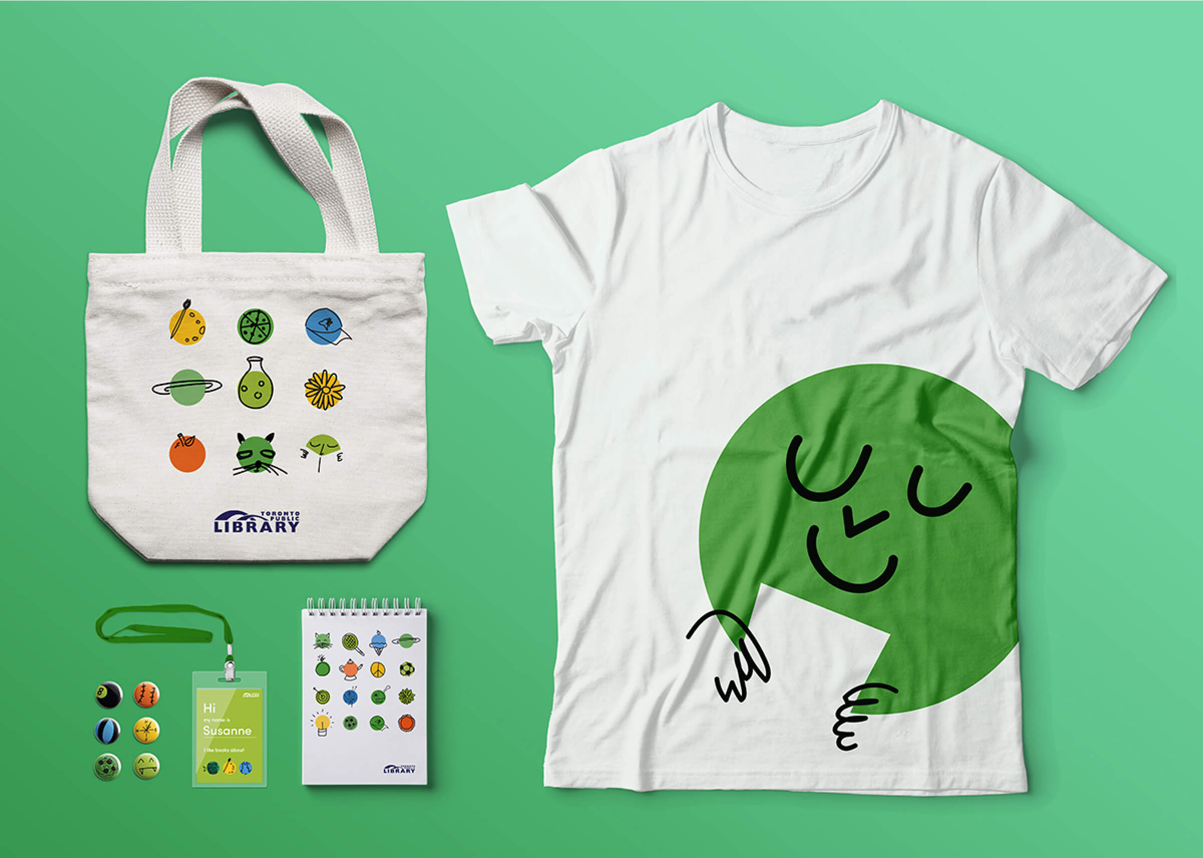
A trail of green dots marks the way towards the children’s section at library buildings new and old.
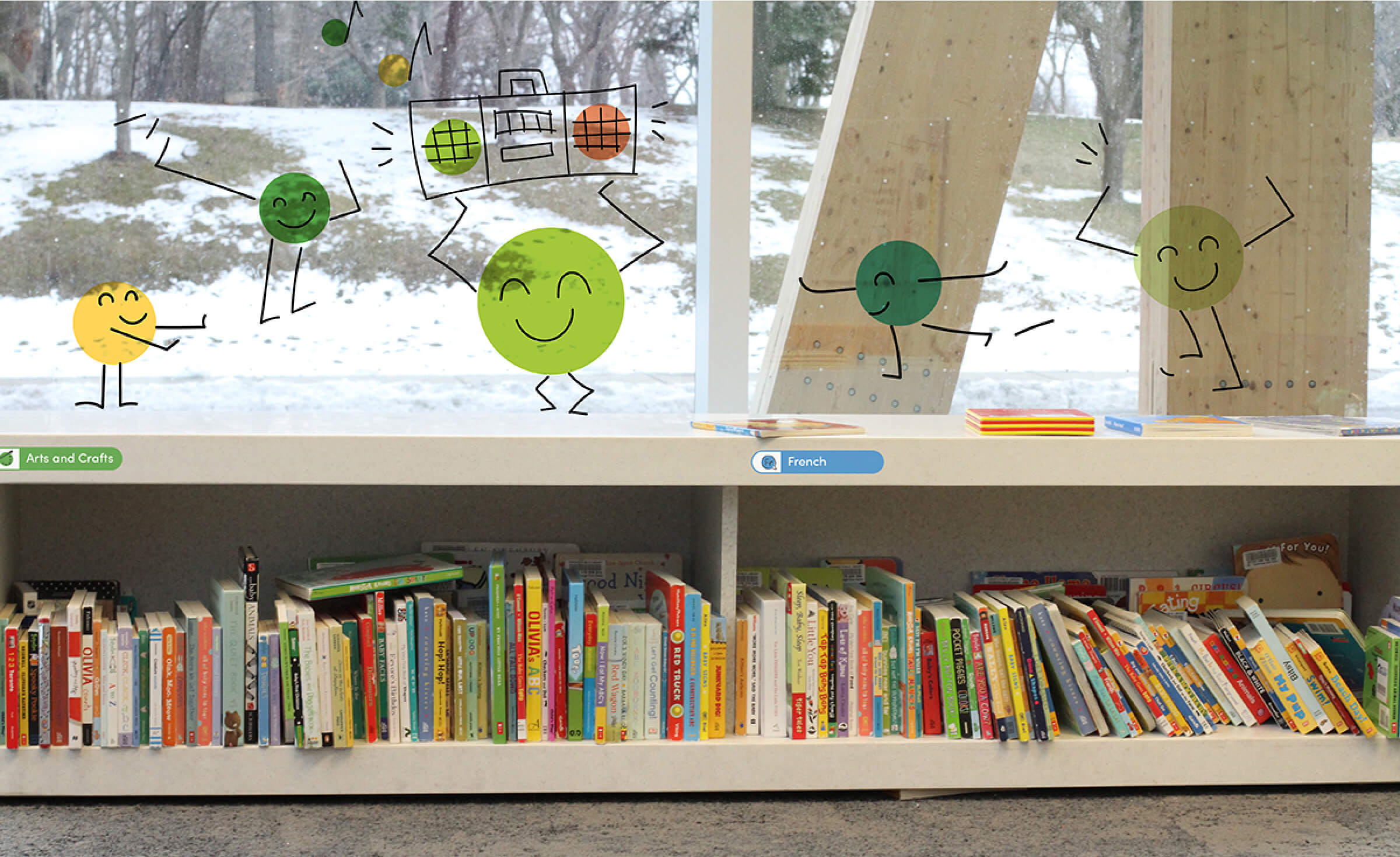
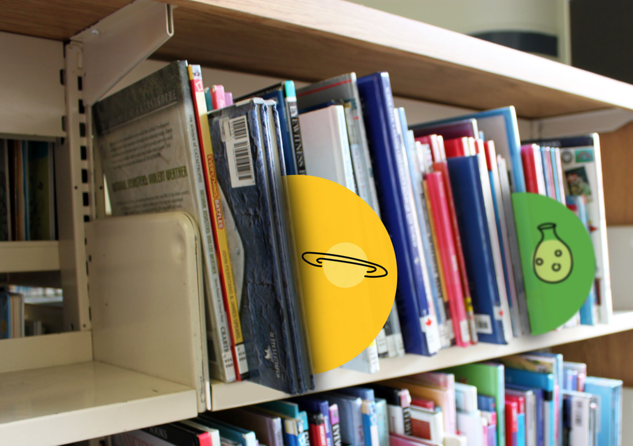
Children’s programs and materials can be easily marked online and on shelves.
It can even be incorporated into children’s activities.
Playfully open-ended, it doesn’t just speak directly to children, it lets them speak within it — the agency lives within the brand mark itself.
The Result
Staff have embraced the brand, incorporating it into the design of their documents and libraries. Applied Arts honoured the green dot with a 2017 design award. And the library got a brand positioning and design system that turns branches into truly active spaces — and helps kids flourish within them.
