Toronto based Swift Medical makes software that performs AI wound analysis with capabilities straight out of science fiction. We helped them upgrade their digital presence to better meet their needs as a fast growing player in healthcare enterprise.
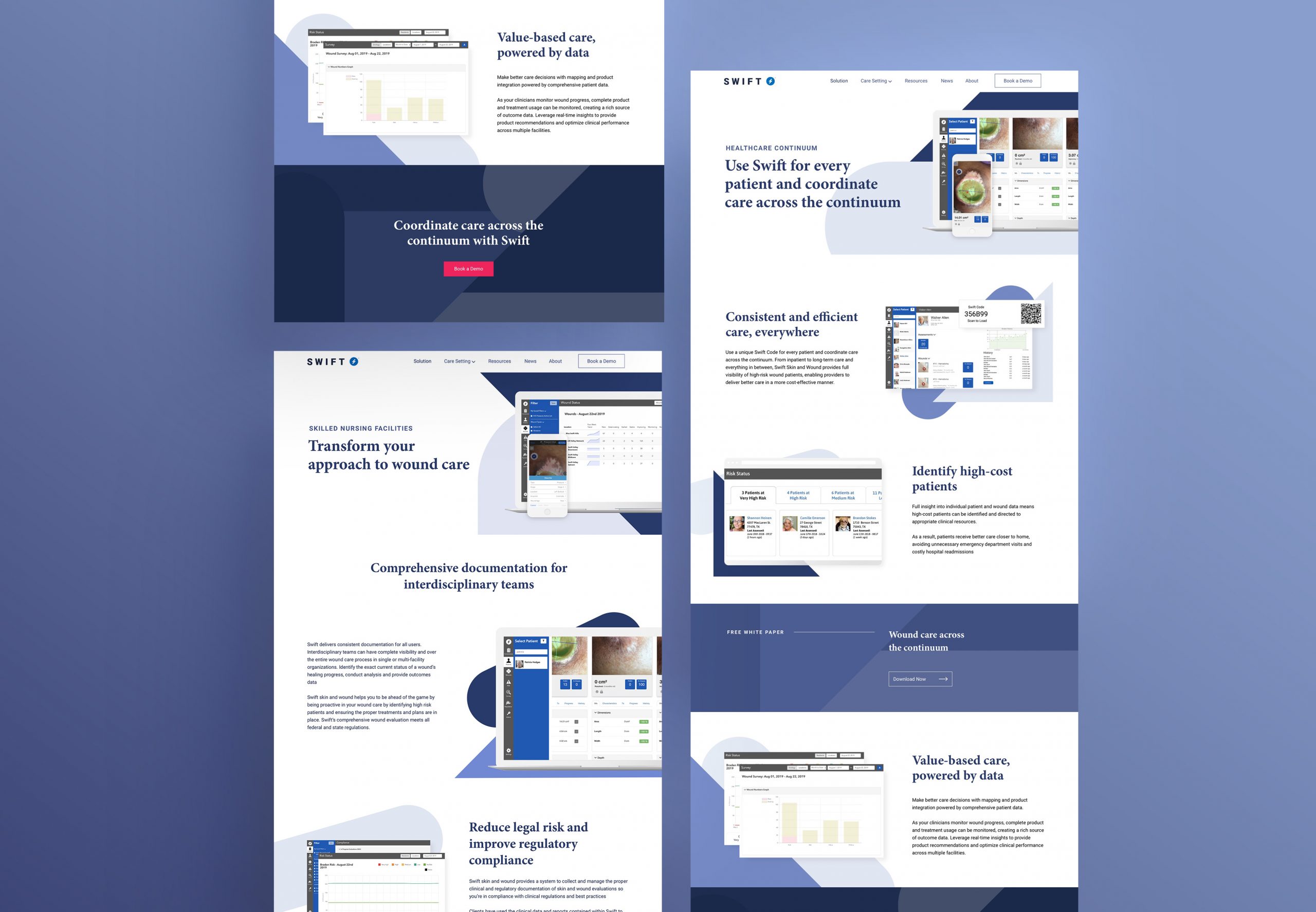
Swift had grown quickly over the past year with new staff, headquarters, and clients. Their website, a crucial sales tool, was a holdover from their startup days and needed to catch up.
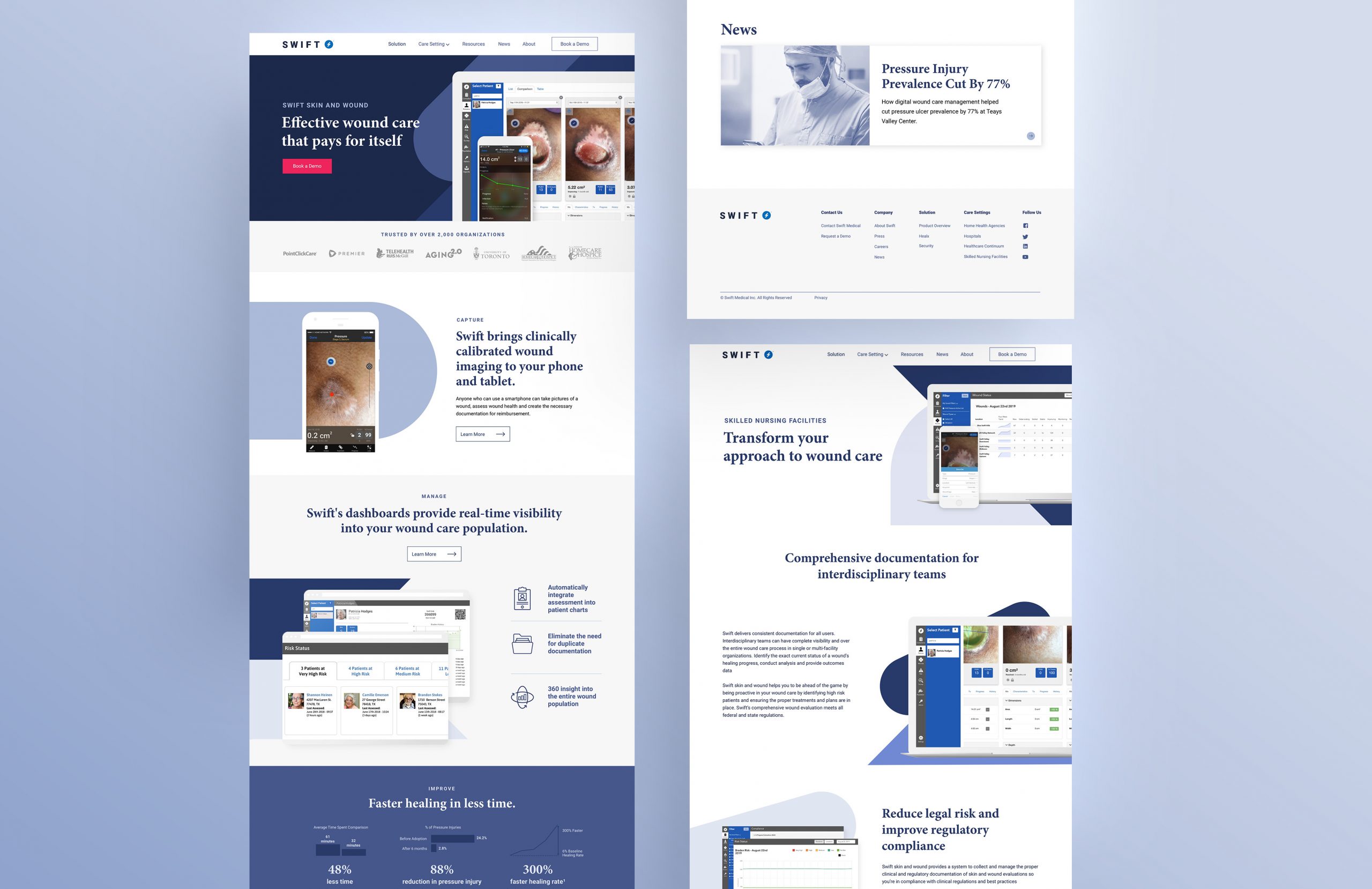
We consulted with Swift’s team to develop design priorities, before collaborating on an updated site structure and new web copy. The goals we identified were to better showcase their flagship product, Swift Skin and Wound, and better demonstrate its value to prospects across the healthcare landscape.
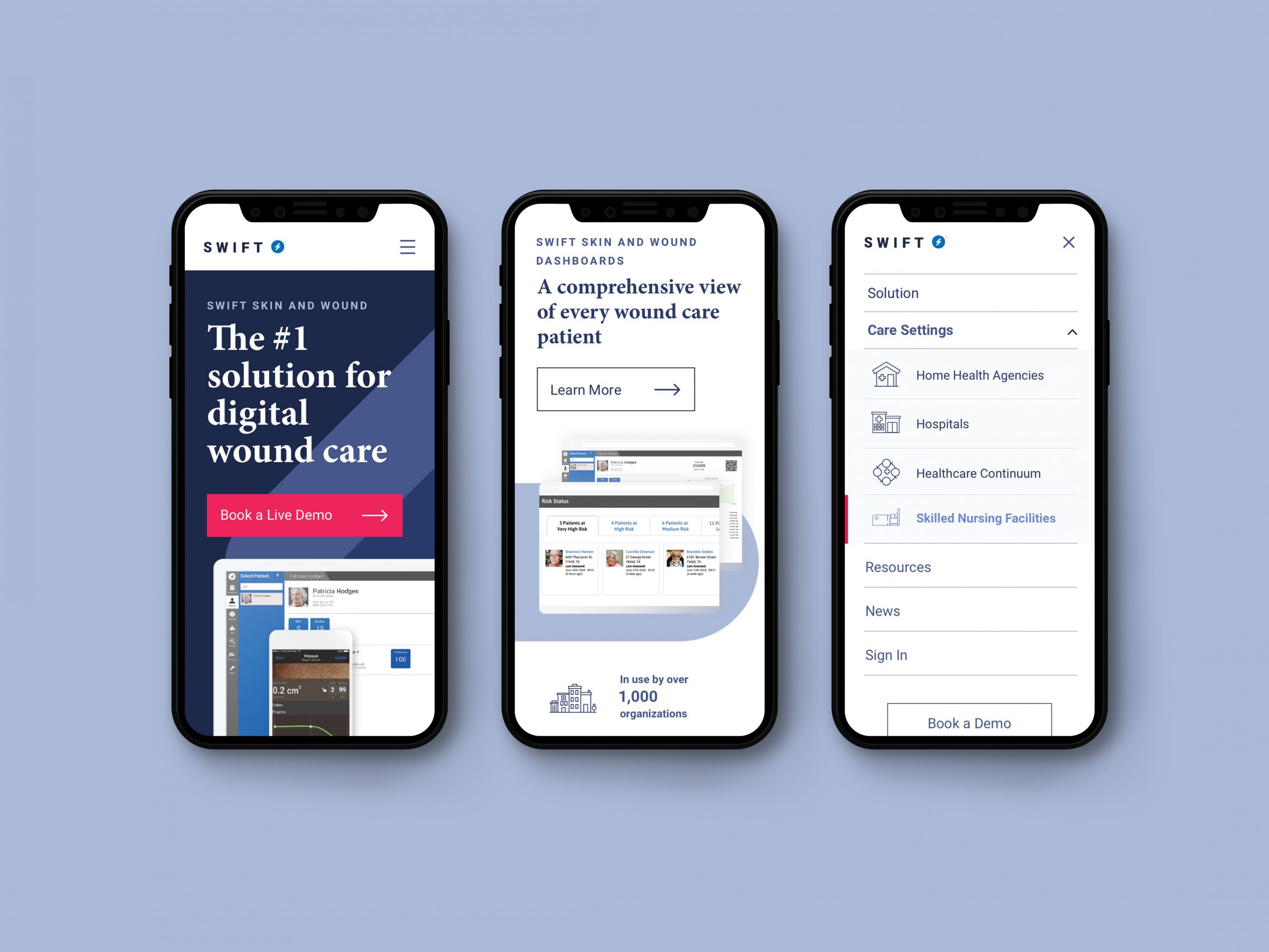
Swift had the foundation of a visual identity – it was a case of better expressing it online. We worked closely with their in-house designer to expand on brand standards and develop a digital design language to demonstrate their expertise and connect with prospects.
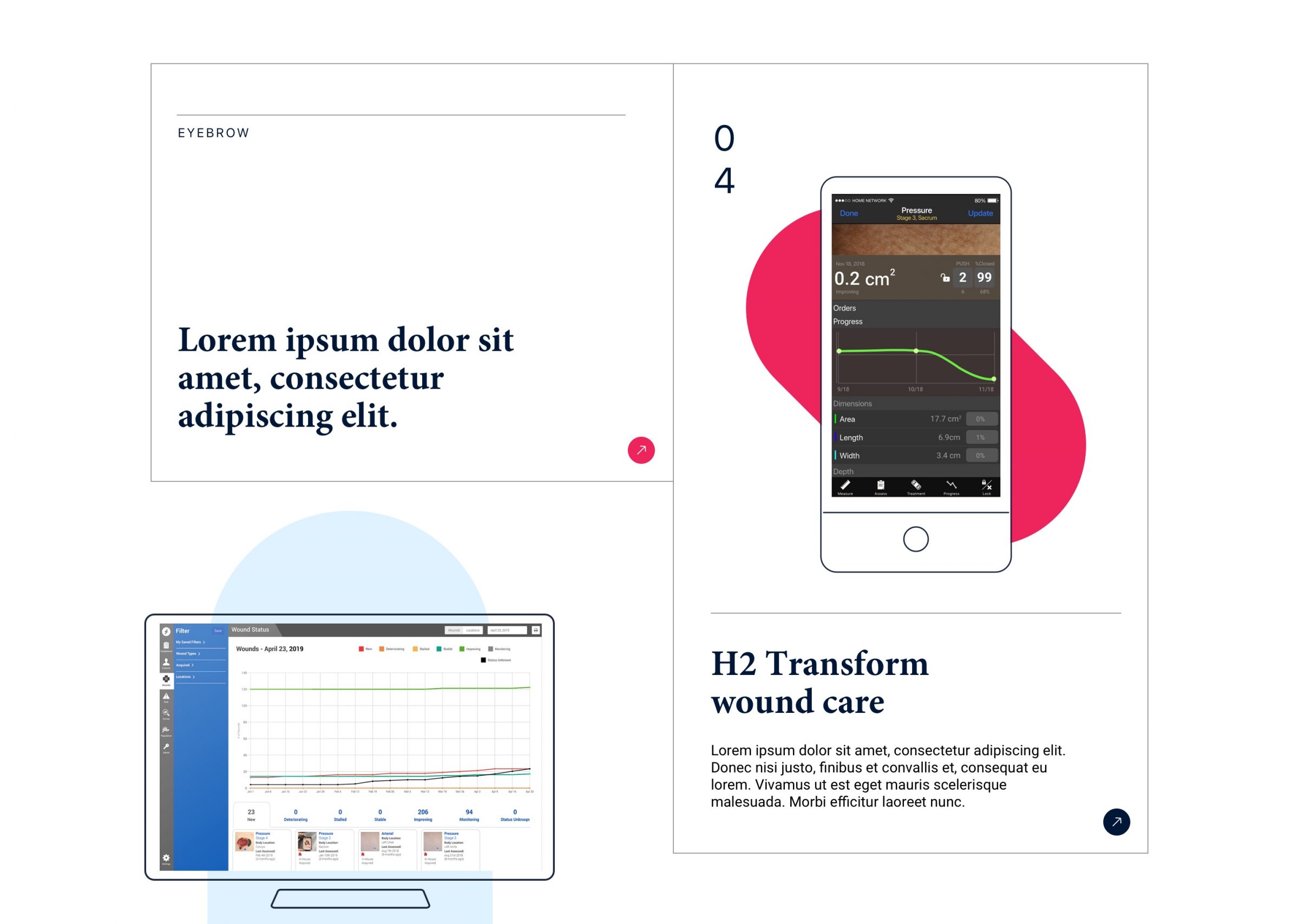
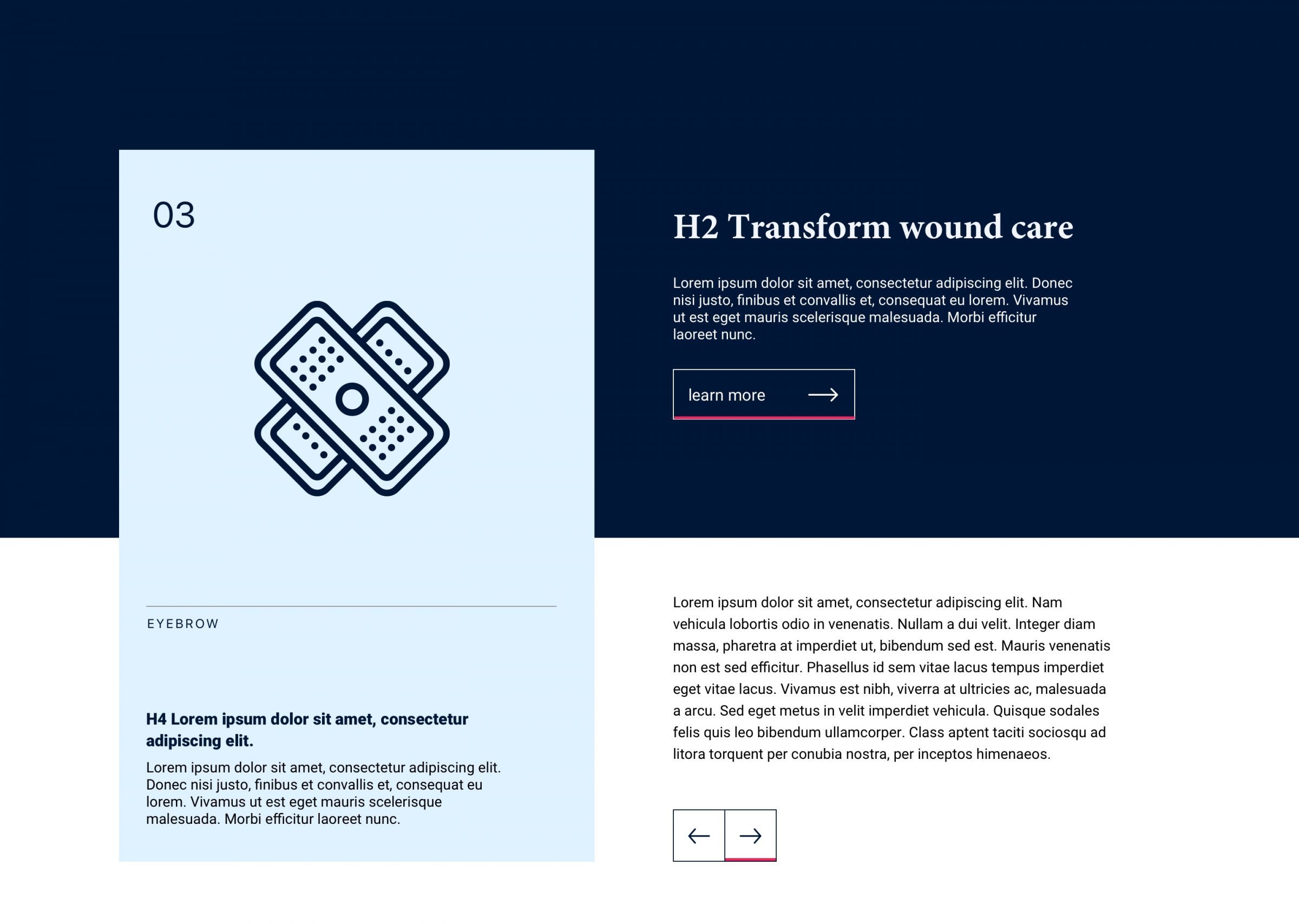
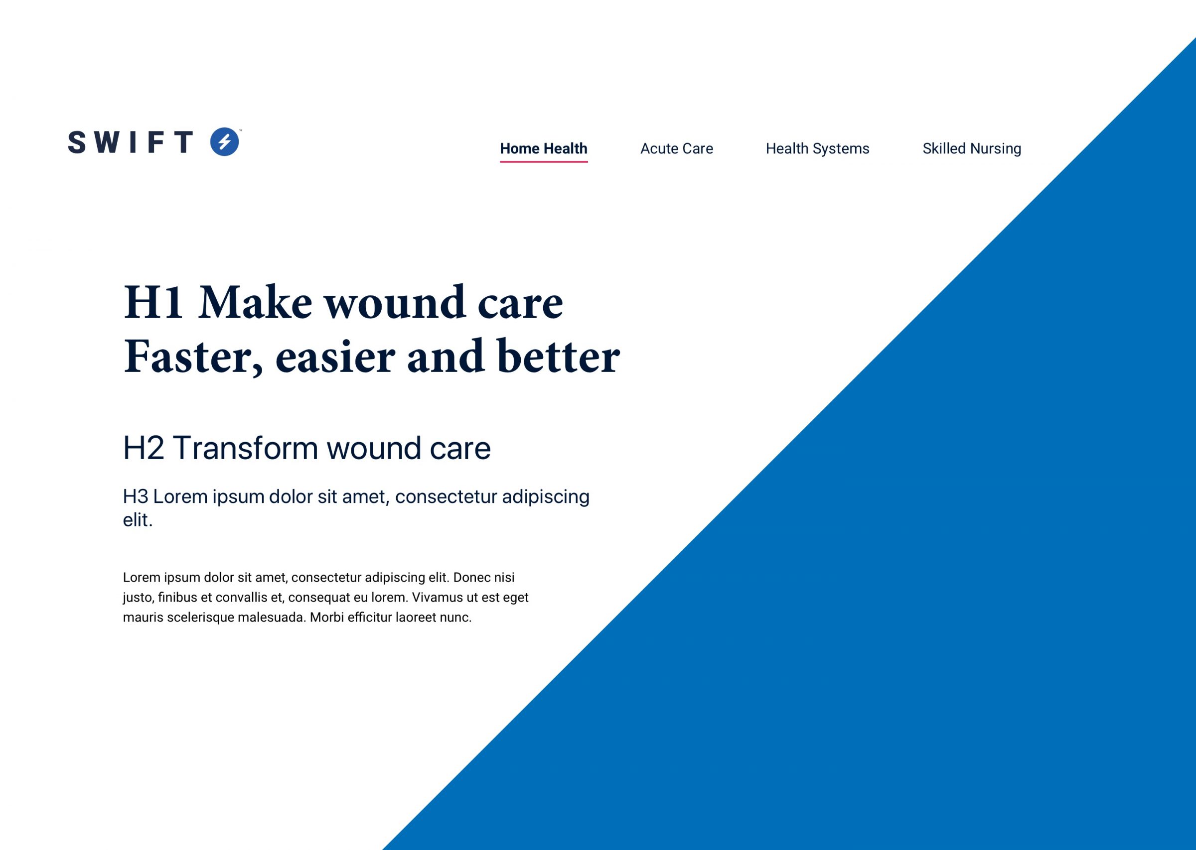
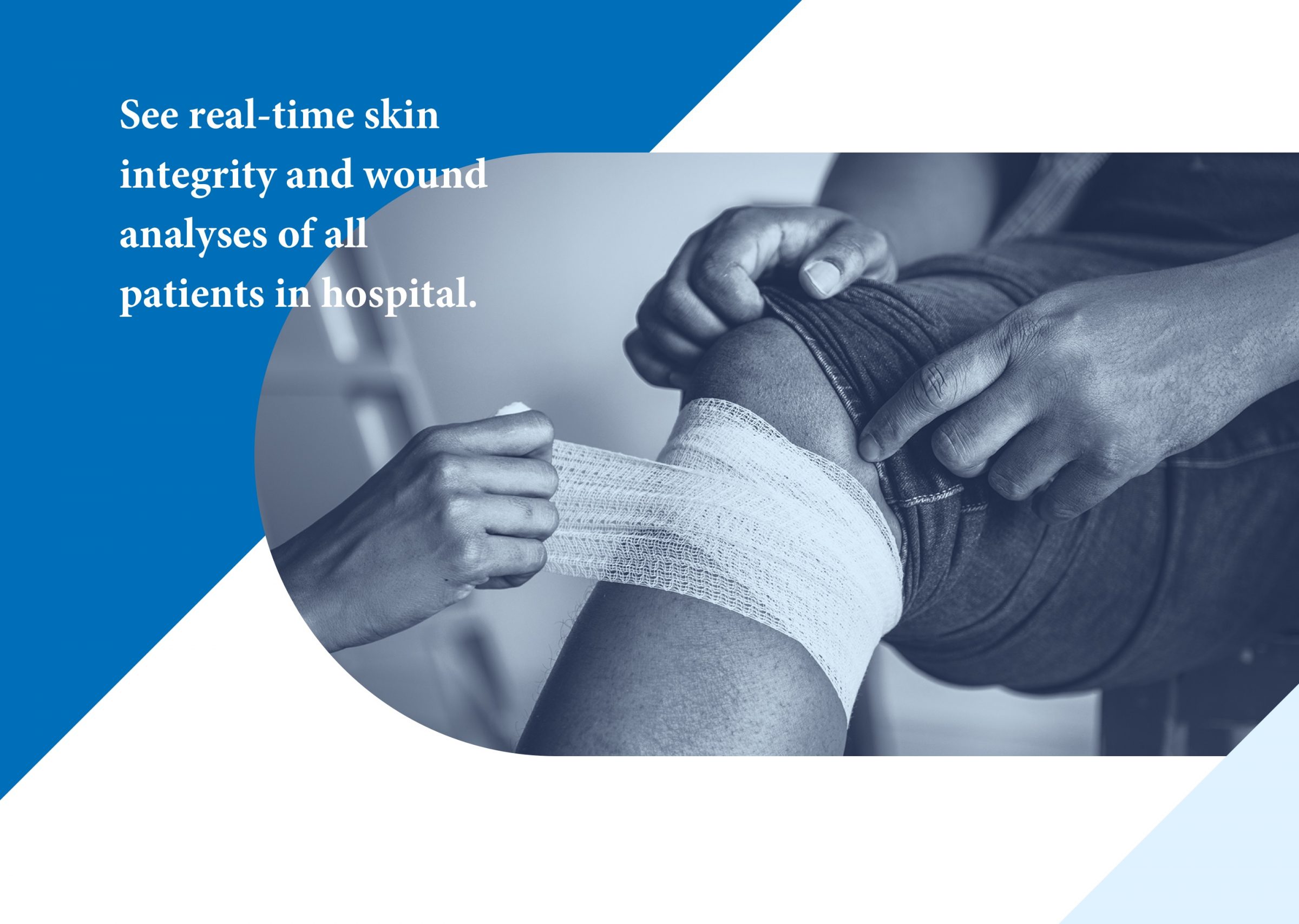
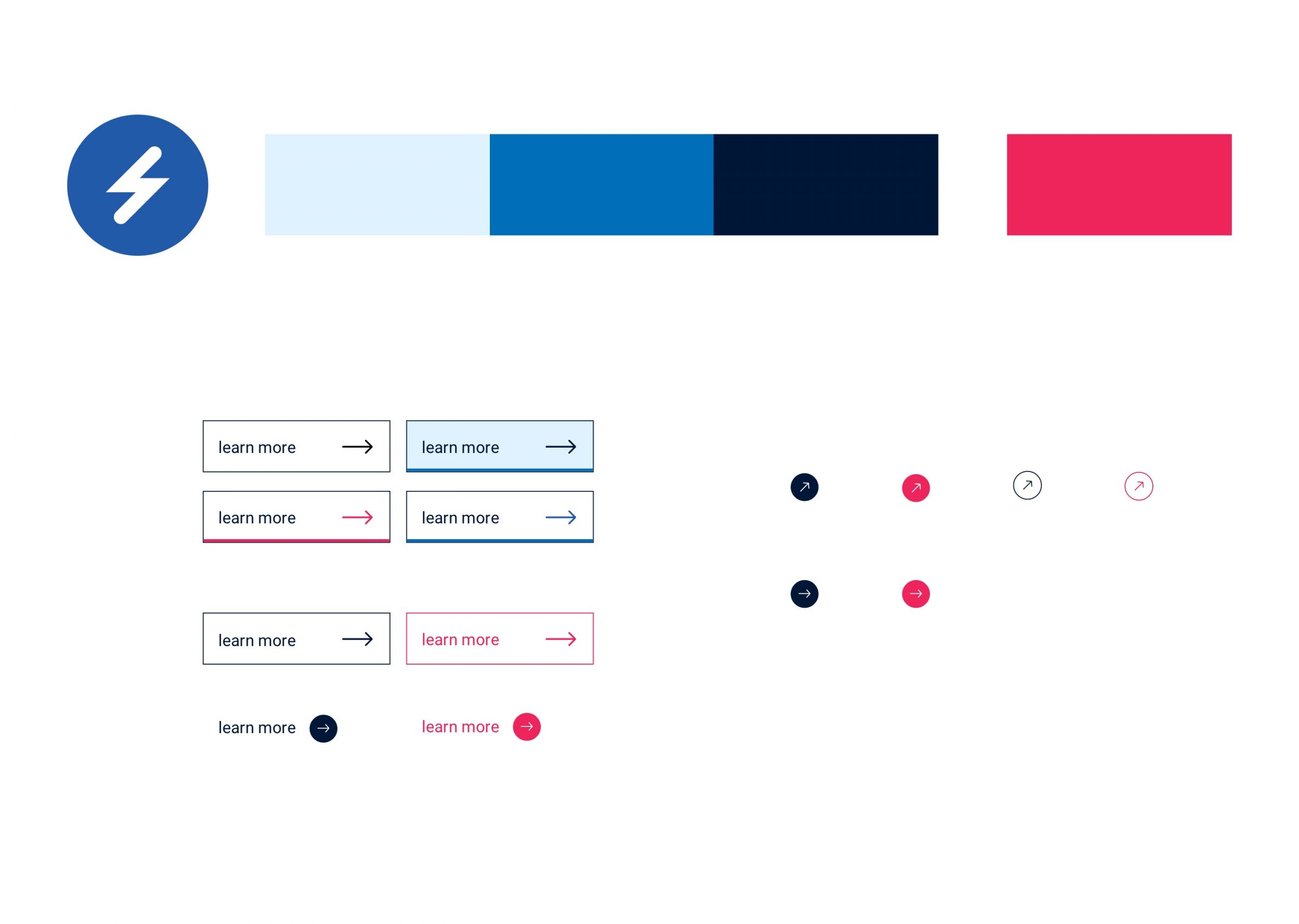
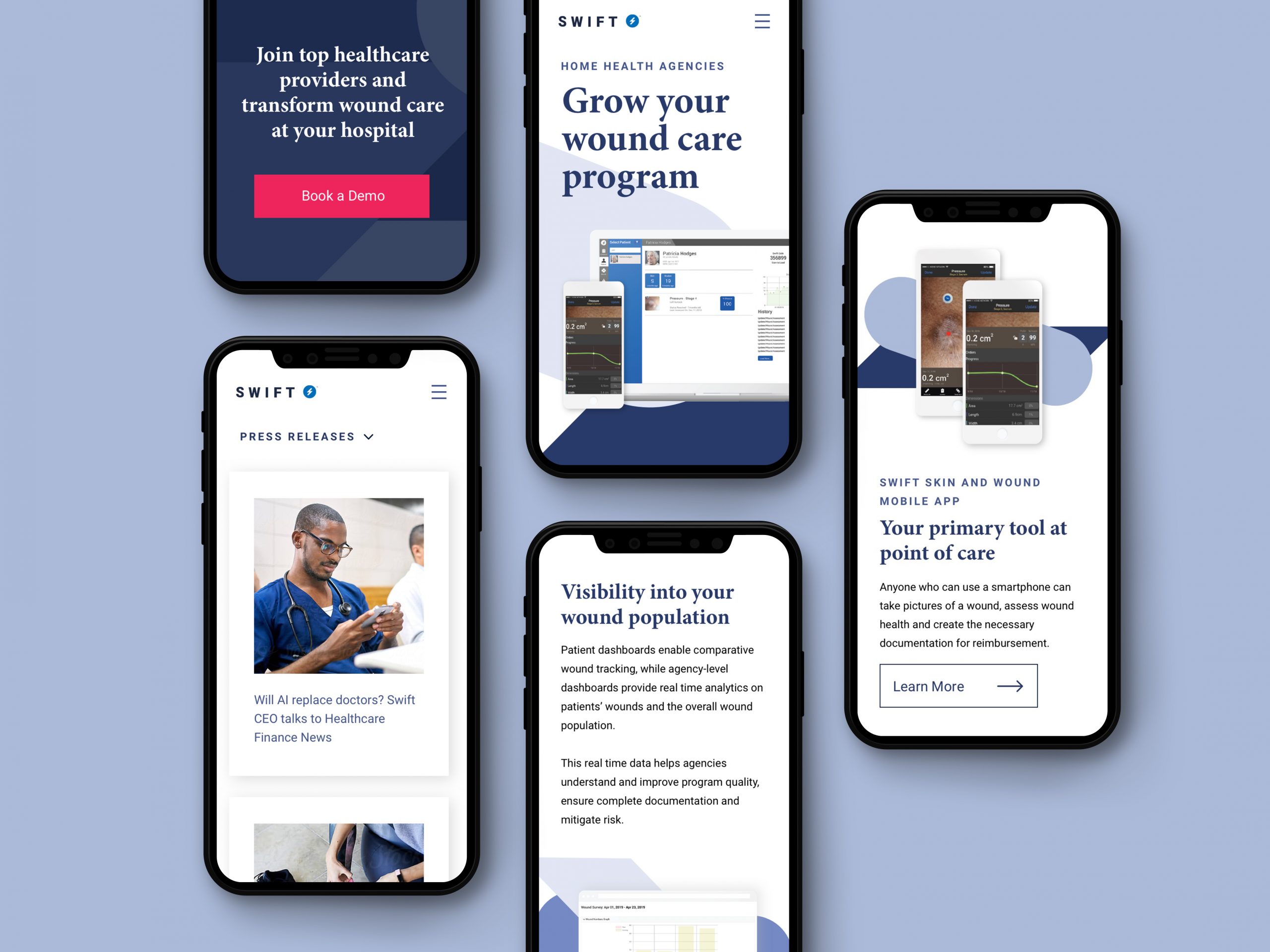
We combined this with wireframe prototypes and iterated on design with their team until we had an experience that properly showcases their industry-leading product, integrates tools for their sales team across verticals, promotes career opportunities, and represents their brand values.

Next we built the site onto a customized, lightweight WordPress instance that was designed specifically for managing their content. We were able to clear a significant amount of clutter from the previous version of the website. The result is something that’s easier to manage and significantly faster and more responsive.

Our Work
- Graphic design
- UX strategy
- UX design
- Web development
