The Challenge
Lee Chow, a family-owned real-estate company, needed to establish a digital footprint for their growing commercial property practice. They needed an identity that reflected their brand — forthright, urban, and efficient. It was a chance for a growing business to make a first impression.
Building trust
As the new real-estate player in town, Lee Chow liked the air of mystery — but only to a point. In a hot market that attracts speculation and people looking for a quick cash-in, they needed to convey both credibility and established presence.
Mental real estate
The visual feel had to convey both the traditional roots of the company as family business, as well as a modern approach to real-estate investing that focuses on properties you can access without a car. Our logo and site design positioned them as a straightforward, downtown company that knew the market and their place within it.
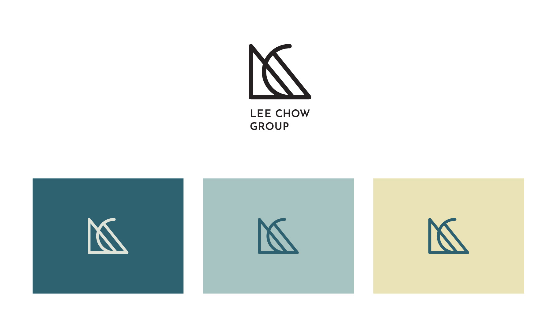
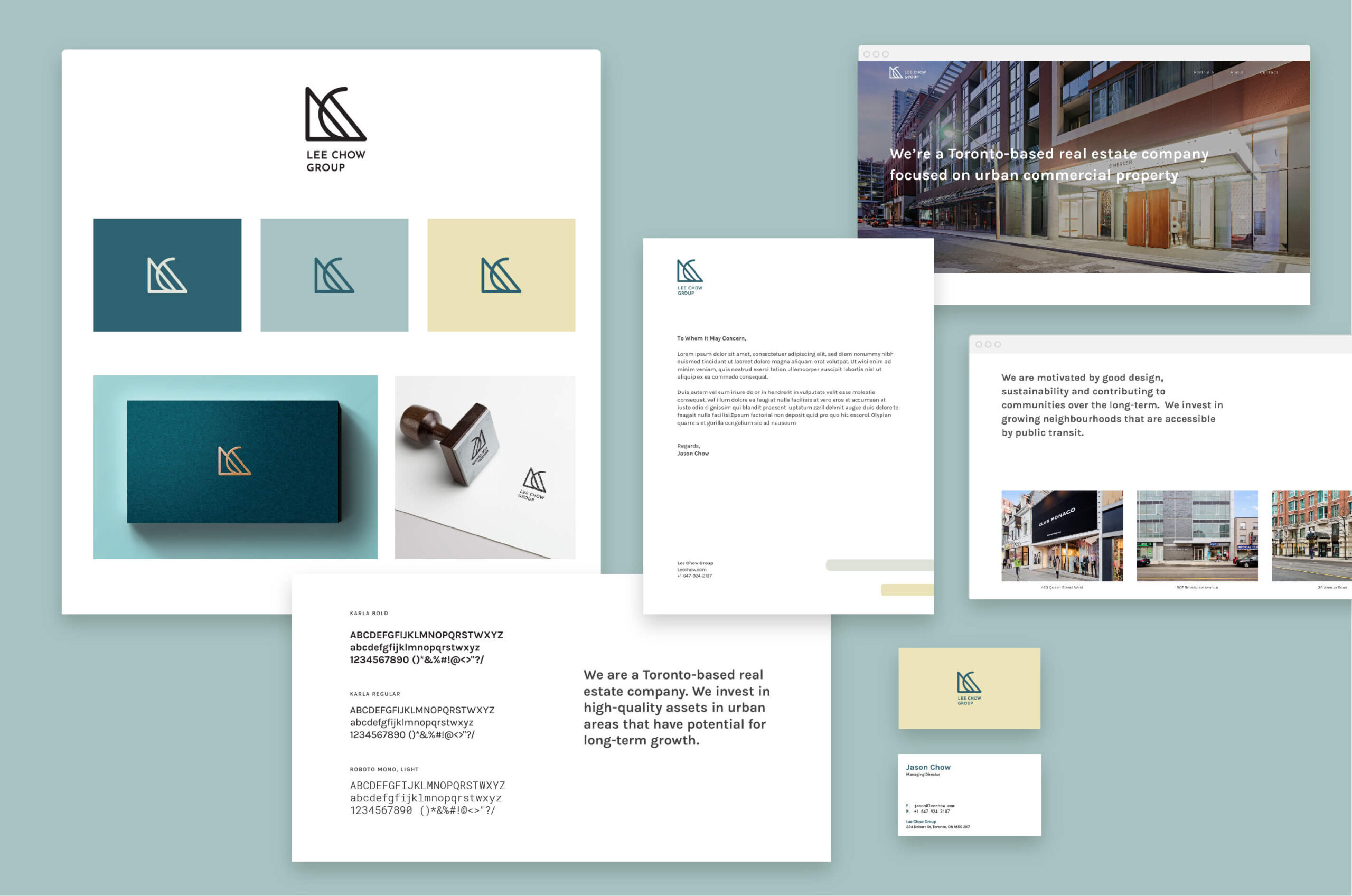
We gave them a simple, clean, unified system that worked across everything from their website and social media presence to their letterhead and business cards, ensuring every aspect of their public face helped tell their story.
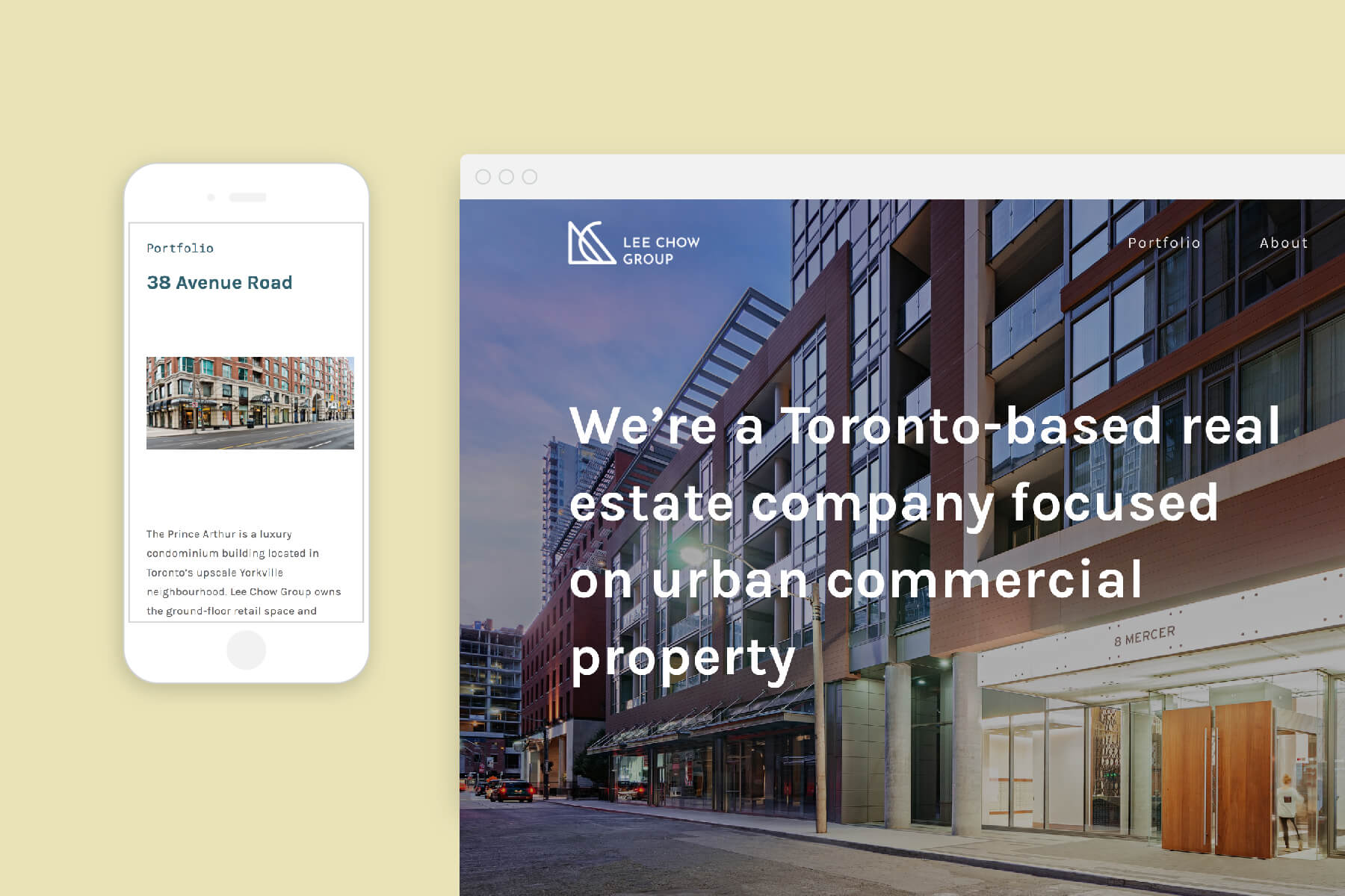
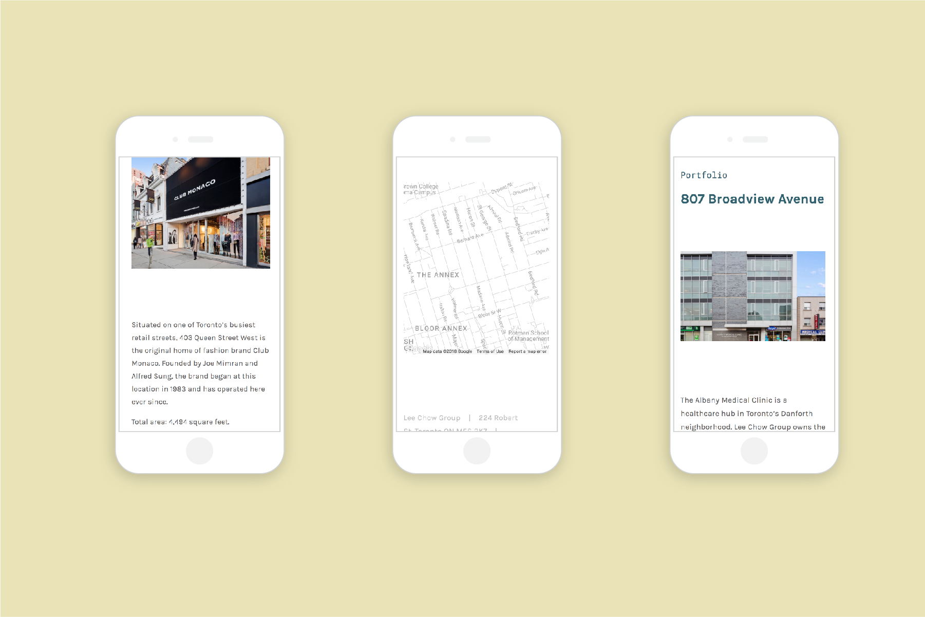
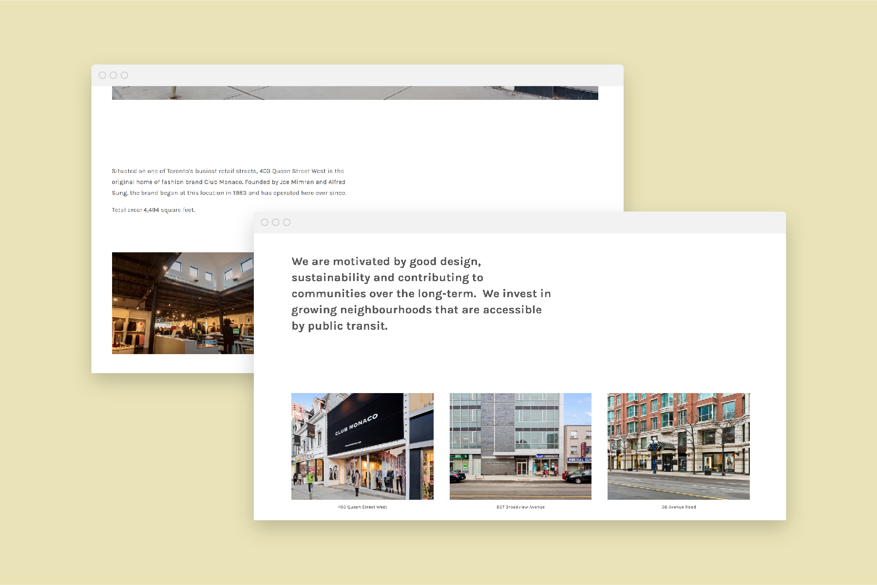

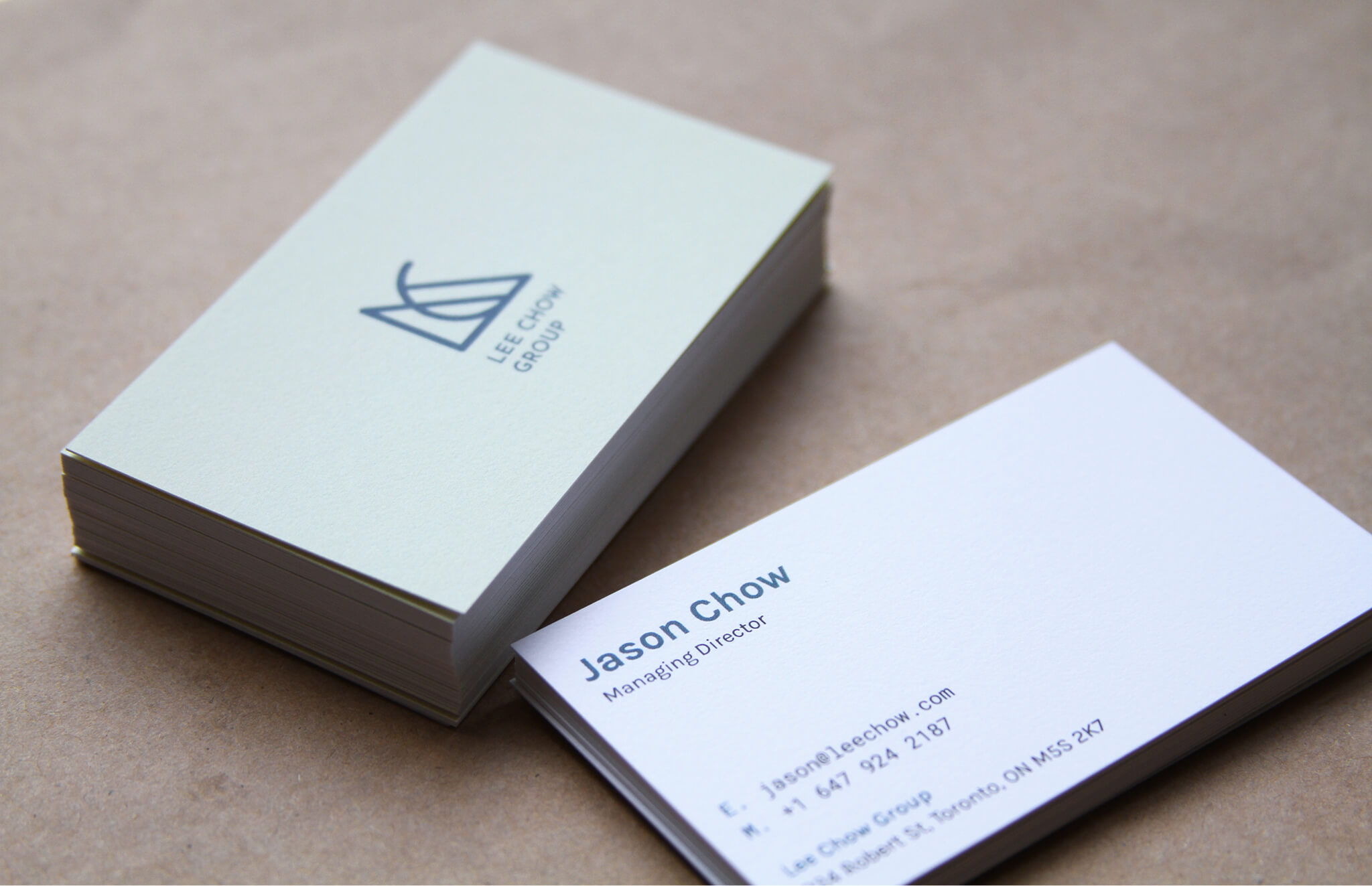

Lee Chow works with many investors from outside the market, who often lack experience or understanding of Toronto’s real estate landscape. We crafted a visual feel that presented the city as a friendly place to invest — with Lee Chow as your trusted guide.
