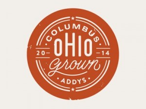
For a while the circle was ascendant…
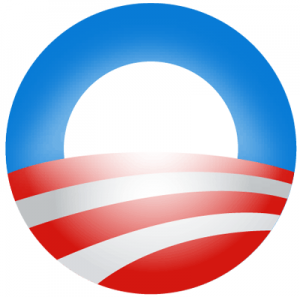
Everywhere you looked, there was a seal, stamp or oval of authenticity.
Faux-vintage badges of credibility clogged up our feeds, invoking wax seals, weathered medallions and anything else that suggested happier, simpler times. Patches, bevelled stickers, round things that said, rather edgelessly, “these artisanal, small-batch, hand-milled, organic crackers have been made with pride since 2015.“
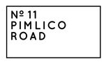
But lo, there’s a new symbol of naked authenticity on the horizon. And it has no round edges. Only plainspoken hairlines. And words in boxes. Now that you’re reading this, you’ll start seeing them everywhere.

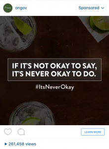
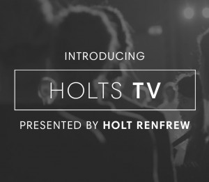

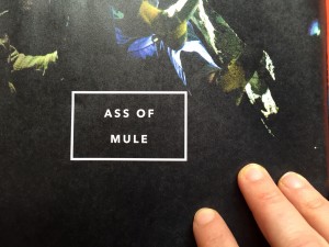
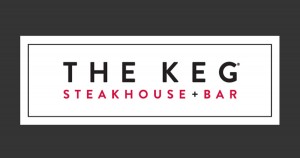

But what do these simple boxes mean? They’re all about truth to materials. The circle/seal/stamp feels fake in the fact that it’s not actually a seal or sticker or stamp. It’s a new thing made to look old, or worse, old-timey. So it makes sense that there’s a bit of a hard-edged backlash to the insistence on telling people when your brand was established, especially if it was established twelve minutes ago. The plain old text-in-box is a pendulum swing towards truthiness. It is what it is. And it’s just words in a box, no sleight of hand or fake screen printing.
At the same time, this ubiquity of style feels a bit homogenous. Writing on Medium, Morgane Santos recently mourned the unbearable homogeneity of design, the idea that so much of what’s being created is samey-samey pretty stuff. This is due, in large part, to a homogeneity on the part of the people creating said designs. The fact that the same little flourishes suddenly appear EVERYWHERE certainly makes one feel that our design language has been impoverished, reduced to safe and pretty at the expense of diverse and interesting.
Seeing this black and white trendlet manifest high and low is a great occasion to reflect on a small corner of homogeneity. Are all these rectangles the best choices that could have been made? Or are they, well, a little square? As a default design choice, you could do a lot worse than text in a box. It’s worked for thousands of years. It’s just that the boxes themselves feel so much the same, all hairlines and sans-serif fonts and minimalist cool. It feels like a trope, albeit a pretty trope.
Will we use text in a box in the future? Yes, of course. But seeing it in such ubiquity is a reminder to constantly push ourselves to broaden our language, our repertoire, our exposure to other ways of presenting information. To think outside the box. (Couldn’t resist.)