Quick political literacy test for you, hot shot: What is your city councilor’s position on transportation, child care or affordable housing? No idea? Okay, how about: What is your city councilor’s name? Still at a loss? You wouldn’t be alone. Based on an office poll, only 48 per cent of us here at Pilot can name the incumbent in our wards; still fewer, 36 per cent, can name a single challenger.
With Toronto’s mayoral race now less than a week away, and so many decisions to make – from who to crown the next mayor to selecting city councilors and school board trustees – we sought an elegant solution to our yearning for answers. And, like so many great things in life, it came in the form of a website.
Pollenize is a non-partisan organization that aims to provide voters with the most accurate election information possible. This group creatively weaves together an atypical team of web designers and developers, content managers, political analysts and marketing professionals. (You can download the app for Android and iOS.) Unfortunately, the site only focuses on mayoral candidates, and a small handful at that – but it’s a start.
Torontonians are inundated with news of lofty platform promises, candidate personalities and histories, political endorsements and the hardest-hitting sound bites on the campaign trail, but many of us remain apathetic about our options, in part because we don’t know how to cut through the noise and uncover the facts. The web presents rich opportunities here. But despite all the talent in digital technology and digital design in Canada, the user experience of the political process still mostly limps along.
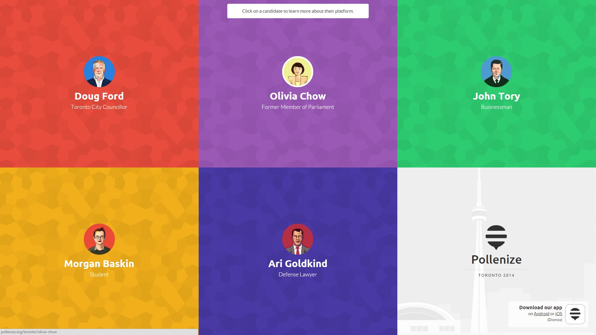
Enter Pollenize. The site’s content is simple and focuses on the major issues. The graphics add an engaging layer of storytelling to the presentation of the candidates’ policies. There’s a straightforward hierarchy of information.
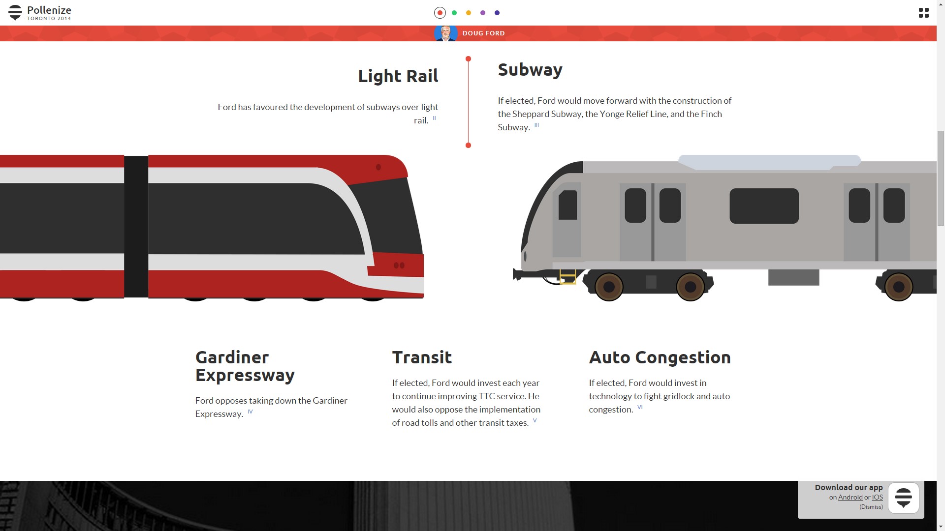
Meanwhile, the lighthearted caricature-style of the graphics make the candidates seem more accessible, and the candidate research process less intimidating.

There are several other groups taking it upon themselves to better educate Torontonians about our candidates by organizing the mishmash of platform promises and policy issues into cohesive digital solutions. Women in TO Politics has compiled a roster of ward candidates, and the Toronto Environmental Alliance is grading mayoral candidates on their approaches to environmental issues. These are far from prize-winning user experiences, but they make a lot of information accessible in just a few clicks.
Candidates are beginning to get the picture. Olivia Chow, for example, gamified her campaign by rewarding supporters with digital badges. And we’re increasingly seeing candidates leverage SEO and lead generation through content-rich blogs and data gathering fields on their homepages.
At Pilot, we think rich user-friendly experiences can improve the democratic process — we just know we’ve got a long, long way to go. As the battle to win hearts and minds rages on, the new digital frontier remains a vast but promising wilderness. Sites like Pollenize remind us that opportunities to improve democracy through digital technology are rich indeed.
For now, here’s where to vote. See you at the polls on October 27.