Civic Ontario
Industry
Nonprofit
Government
Our work
Brand strategy, story, messaging, and positioning
Identity design
Brand guidelines
Collateral design
UX design
Technical implementation support
Bringing civic leadership together to achieve more.
Ontario’s hardest problems don’t respect org charts. Housing, infrastructure, health and economic opportunity are shaped by decisions made across municipalities, public agencies, hospitals, colleges and universities. Progress depends on leaders who can see the connections and act across them. The Ontario Municipal Administrators’ Association (OMAA) had long served as the professional home for municipal chief administrative officers. Its leadership saw a larger role: bringing together senior executives from across the institutions that shape Ontario’s communities. Pilot helped define that ambition and give it a strategy, a name, an identity and a digital home.
Beyond city hall
The first question was what the organization should stand for as it opened its membership to a broader group of civic leaders.
Working with leadership, we built a position that kept OMAA’s municipal credibility and opened the door to leaders of hospitals, colleges, universities and other anchor institutions. At its centre is one idea: strong communities need leaders who see the whole picture. Civic Ontario would be where those leaders meet, share what they know, and build the relationships to solve problems no single institution can solve alone.
That idea gave the organization’s new role a clear expression, and became the foundation for everything that followed.
A name with room to grow
OMAA named a profession. Civic Ontario names a shared purpose. The name shifts the emphasis from administration to contribution, from what members manage to what they can accomplish together.
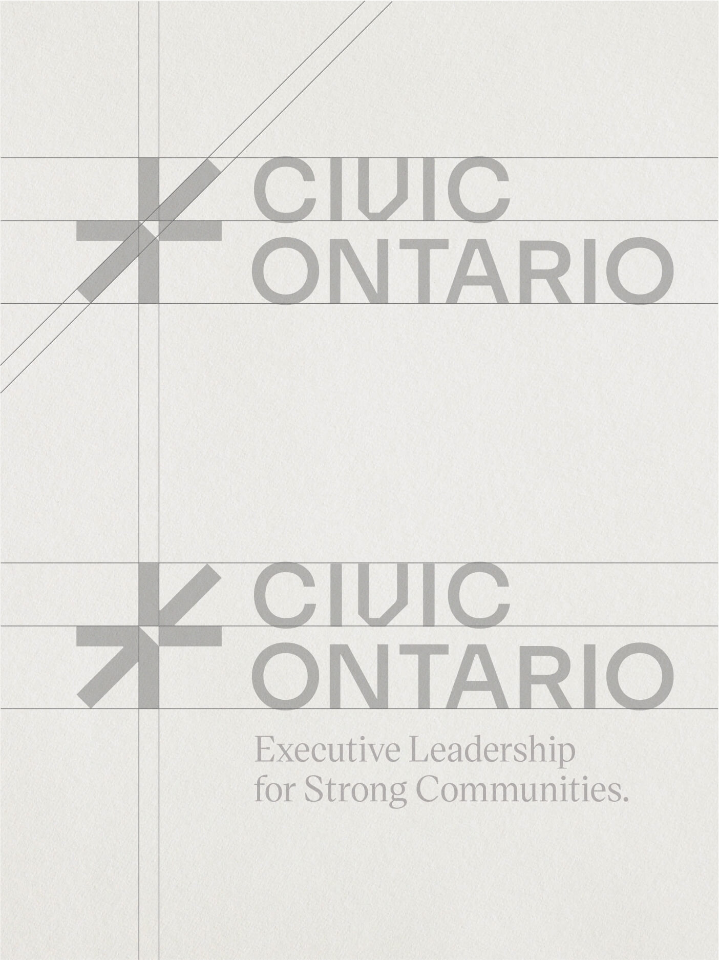
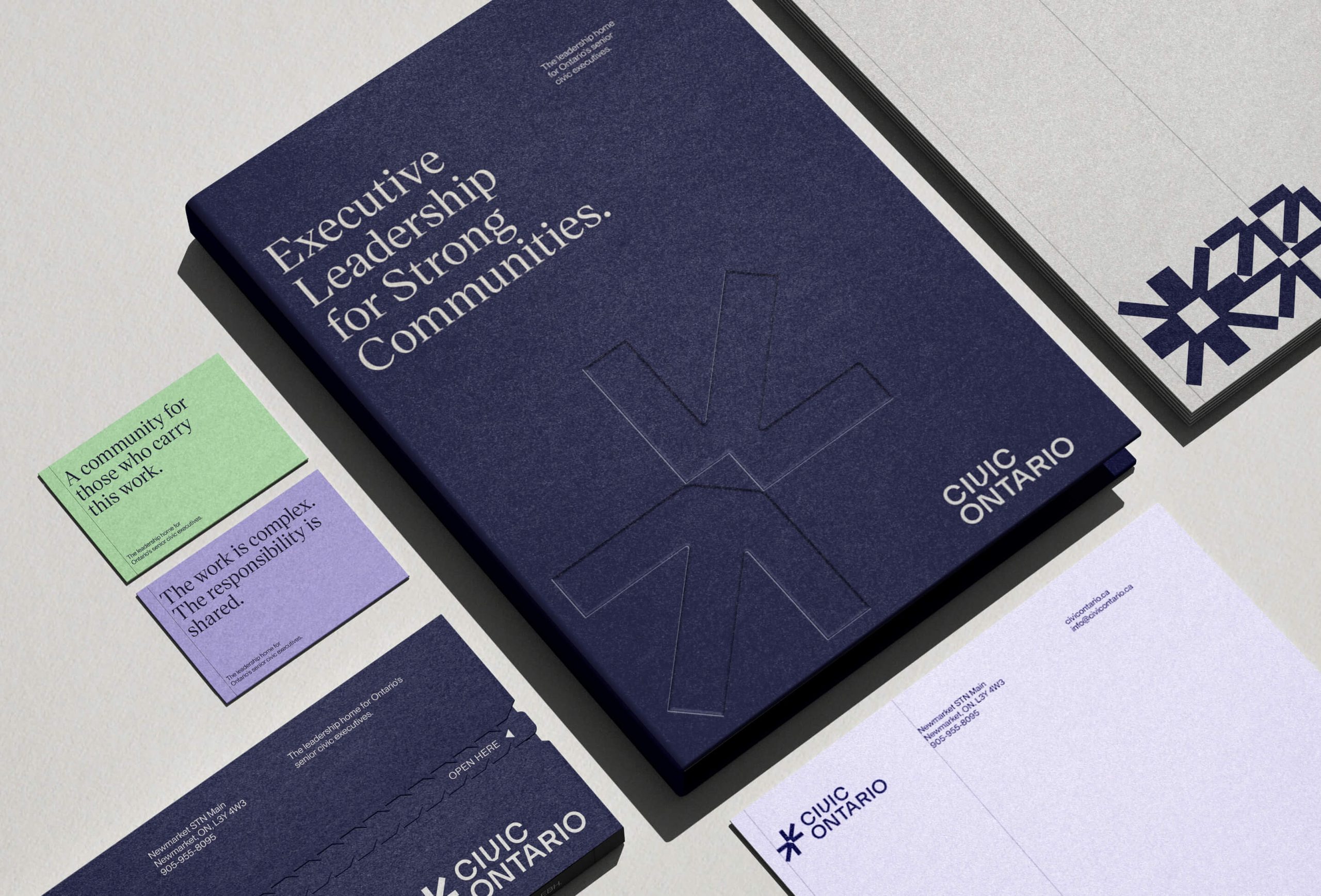
The line Executive Leadership for Strong Communities ties that leadership to its purpose.
An identity built on connection
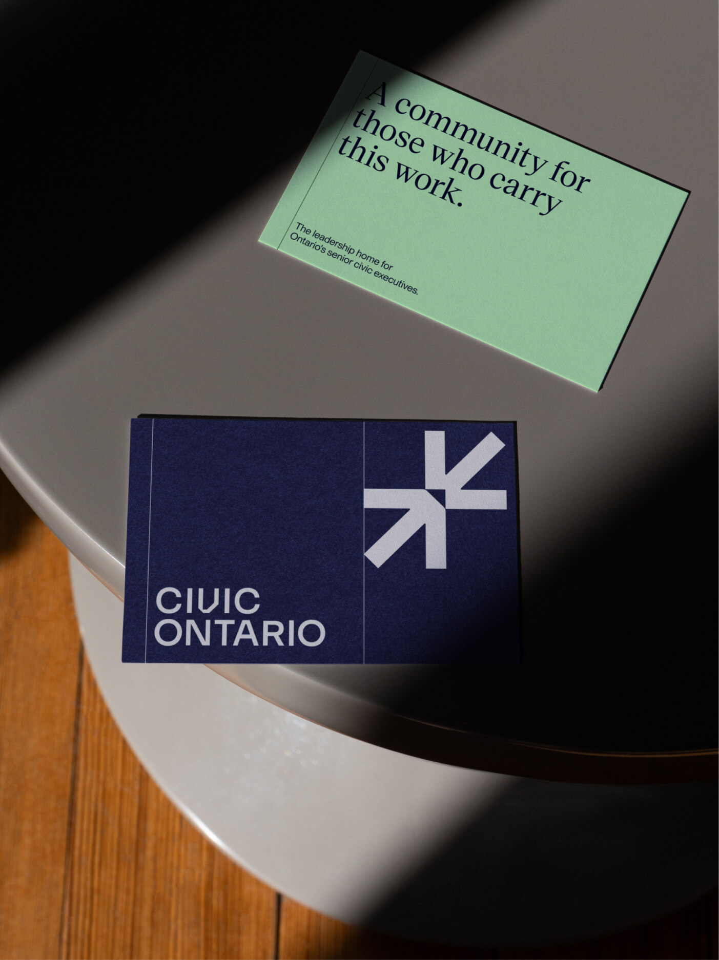
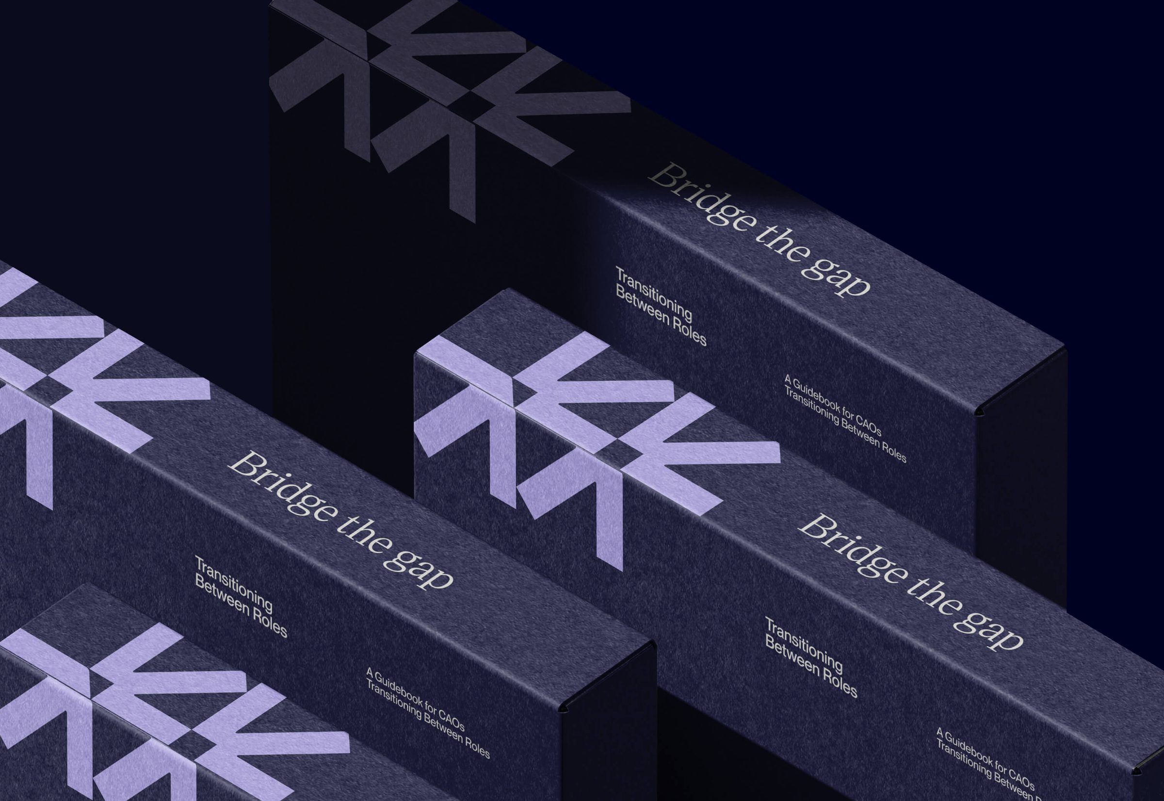
Broadening membership meant moving beyond a long-standing association’s identity without losing the credibility it had earned. The new identity is built on the idea of collaboration in motion: arrows moving in different directions, connected at a shared centre, like diverse leaders aligning around common challenges.
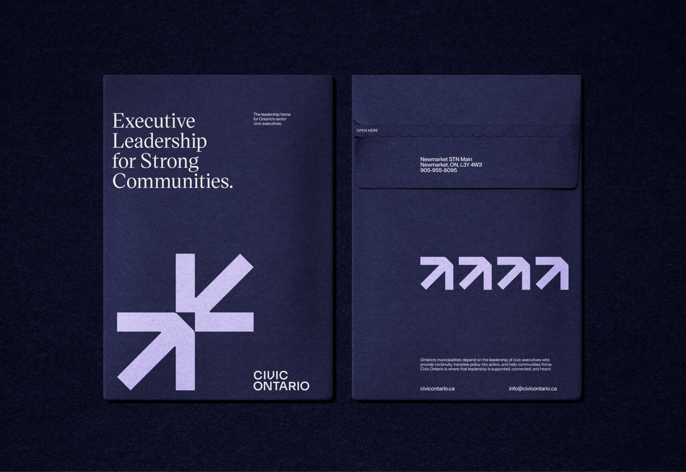
Broken into its arrow forms, the symbol becomes the centre of a graphic system, scaling from bold crops to patterns, icons and visual cues. The result is a recognizable presence across everything Civic Ontario produces.
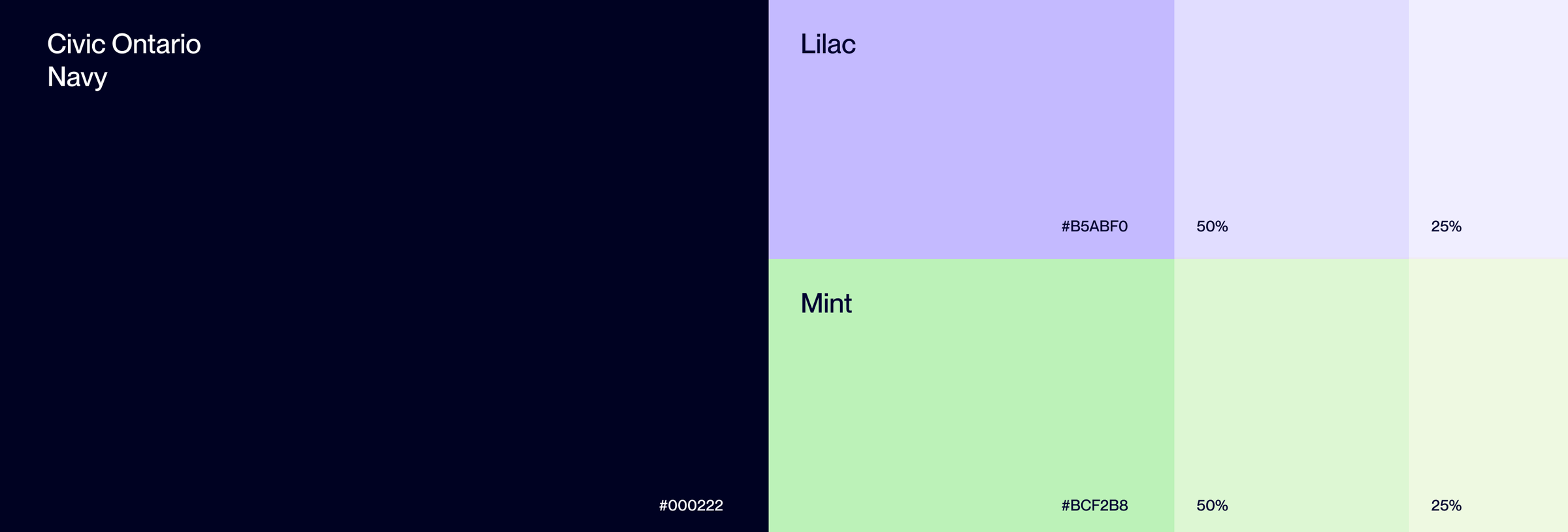
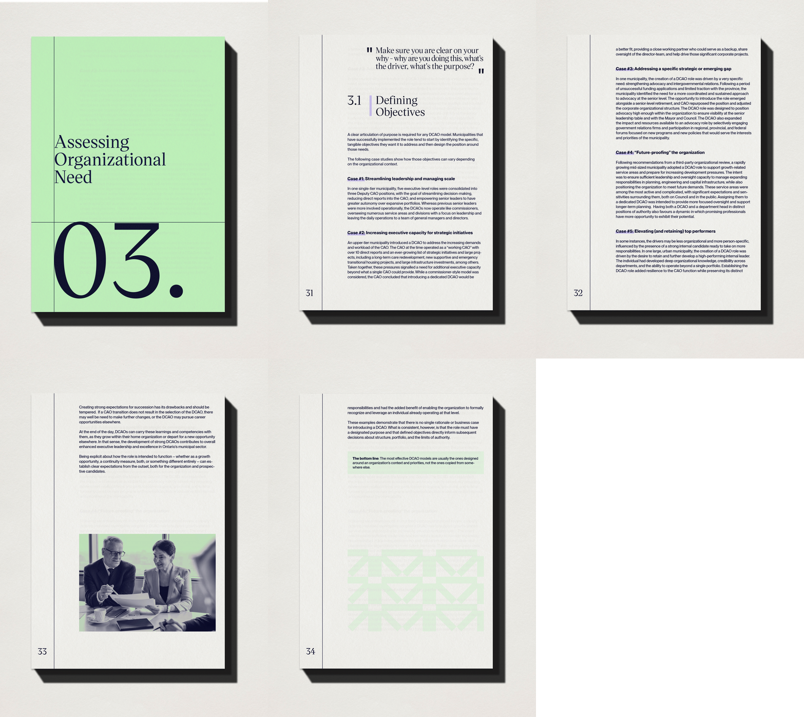
Serif headlines bring authority and a clean sans serif keeps information clear. A deep navy signals trust, while mint and lilac accents add energy and keep the brand from looking like a government department. That matters for an organization that speaks for its members.
Photography shows real leaders and communities rather than generic stock, with duotone treatments that unify event photos and member headshots. A woodcut-inspired illustration style drawn from Ontario motifs gives articles and resources a distinct look.
Brand guidelines and messaging, from the core narrative to logo use and application examples, let the team explain the new mandate consistently and produce materials without starting from scratch.
A website members come back to
The website is where most prospective members first meet the organization. We led information architecture and UX design, then handed off to Civic Ontario’s existing technology vendor for implementation.
A member survey and site audit surfaced findings familiar to many associations. Members came for events and the job board, relied on the newsletter for everything else, and saw the site as a utility. It led with administrative tools, said little about purpose, and lacked the substance members wanted: resources, insight and peer stories.
We restructured the site around three questions every prospective member brings: What is this? Is it for me? How do I take part? The homepage now opens with a statement of purpose, and navigation follows how members use the site. Career stages, from aspiring leaders to those in transition, became a primary way into the content.
The design gives the site the presence of a leadership institution while making full use of the existing membership platform. The vendor received build-ready designs and specifications, and the team a content plan for building depth over time.
The result
Civic Ontario now has a clear strategy, a leadership team aligned behind it, and a brand that makes the new direction easy to see and easy to join. It has a story strong enough to bring senior leaders together across institutional boundaries, and a platform to turn their collective knowledge into progress for Ontario’s communities.